Fragrant Jewels • E-Commerce UX • Mobile Design
Helping first-time shoppers reach checkout
Most new visitors left before buying. The product was strong, but the site was hard to understand on a first visit. We ran research, rebuilt the menu, and designed a clearer mobile homepage to help more new shoppers reach checkout.
Role
UX Designer, 4-person team
Platform
Mobile Web, E-Commerce
Methods
Interviews, Card Sort, Prototyping
Deliverable
Final mobile screens
01 - Overview
A great product, hidden behind a confusing site
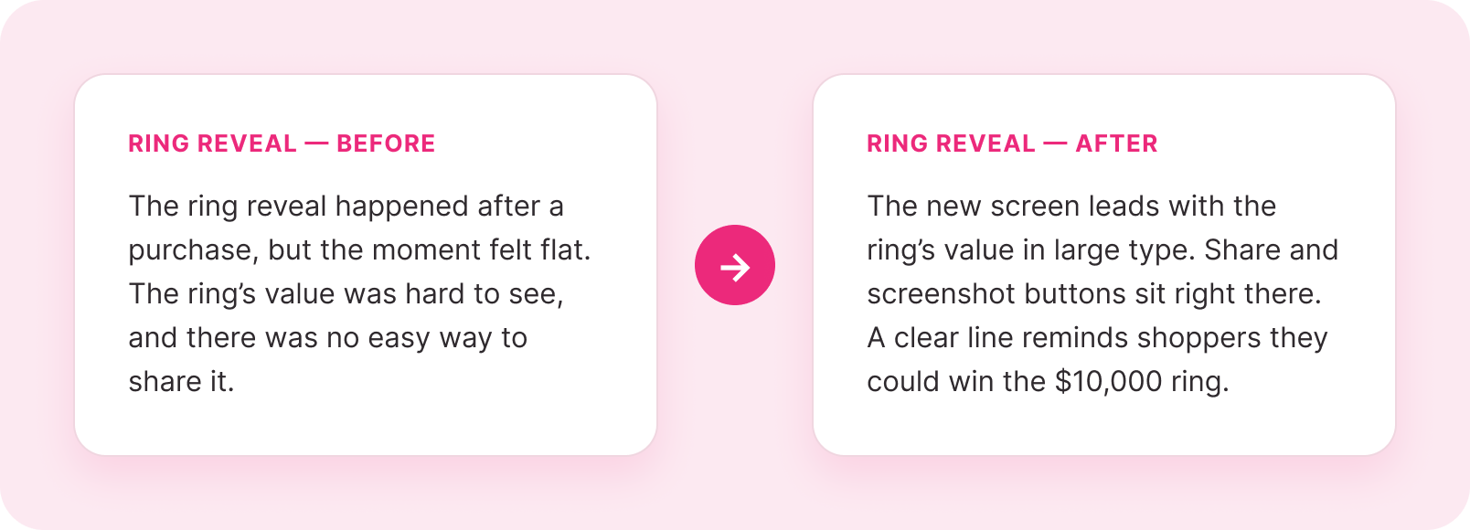
Fragrant Jewels sells candles, bath bombs, and body scrubs. Every product has a hidden ring inside, worth anywhere from $10 to $10,000, plus a code for a chance to win a $10,000 ring. That surprise is the whole reason people love the brand and keep coming back.
The problem was about new customers. Most people who landed on the site for the first time left without buying. Only about 1.4% of new organic visitors made a purchase. Email and paid traffic did a little better, but still below the rate the brand wanted. Across all traffic, the site had about 100,000 chances a month to win a new customer and was converting around 150 a day. The goal was 300.
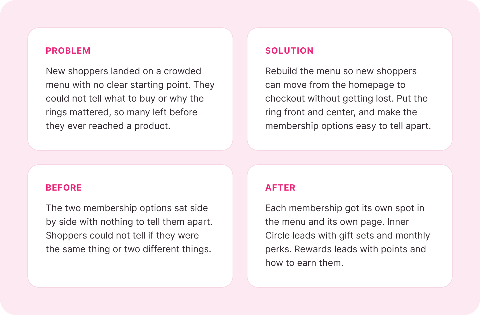
Our research showed why new visitors were leaving. The site dropped them into a long, busy menu with little to explain the product or the brand. People could not tell what to buy, how the ring worked, or why the brand was worth their time. The ring was the best part of the story, and the site treated it like a footnote.
02 - Research
We ran one-on-one interviews and testing sessions with new users who had never seen the brand before. We gave each person three tasks to find where the site broke down: buy a specific bath bomb, sign up for the Rewards program, and join an Inner Circle membership.
Every person struggled with at least two of the three tasks. The same problems showed up in every session.
Three tasks. Three points of failure.
03 - Persona
Who we designed for
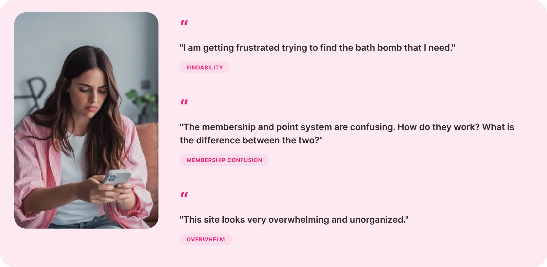
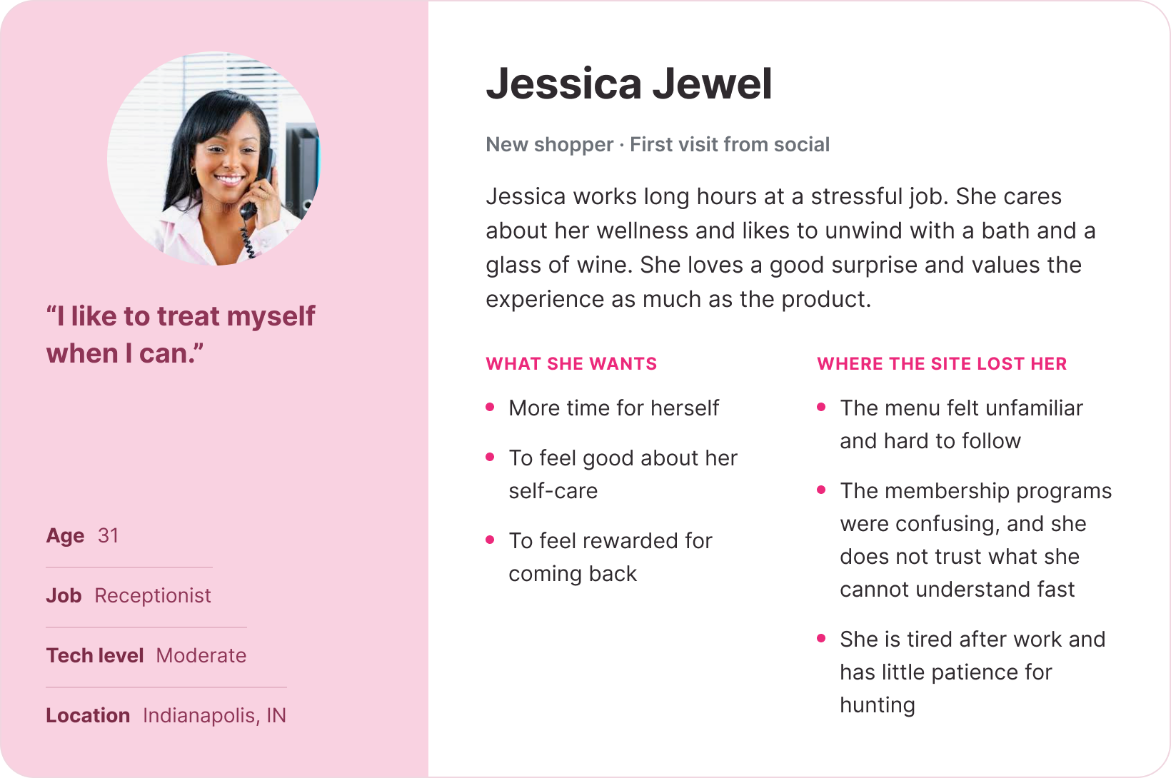
We turned the research into one persona to keep the team focused on a real person. Jessica stands in for the typical new Fragrant Jewels shopper, and her pain points pointed straight at the work we needed to do.
04 - Information Architecture
Card sorting showed the menu had too many top items
The old menu showed every product type, collection, and program as its own top item. There were too many choices, and people gave up before picking one. In card sorting, we let users group the site content in a way that made sense to them, with no help from us.
After a few rounds, one pattern was clear. The menu needed fewer top items. People grouped all the collections under one entry, expected membership and rewards in separate spots, and wanted the ring easy to find from the start. This did not cut any products. It just removed repeated sections.
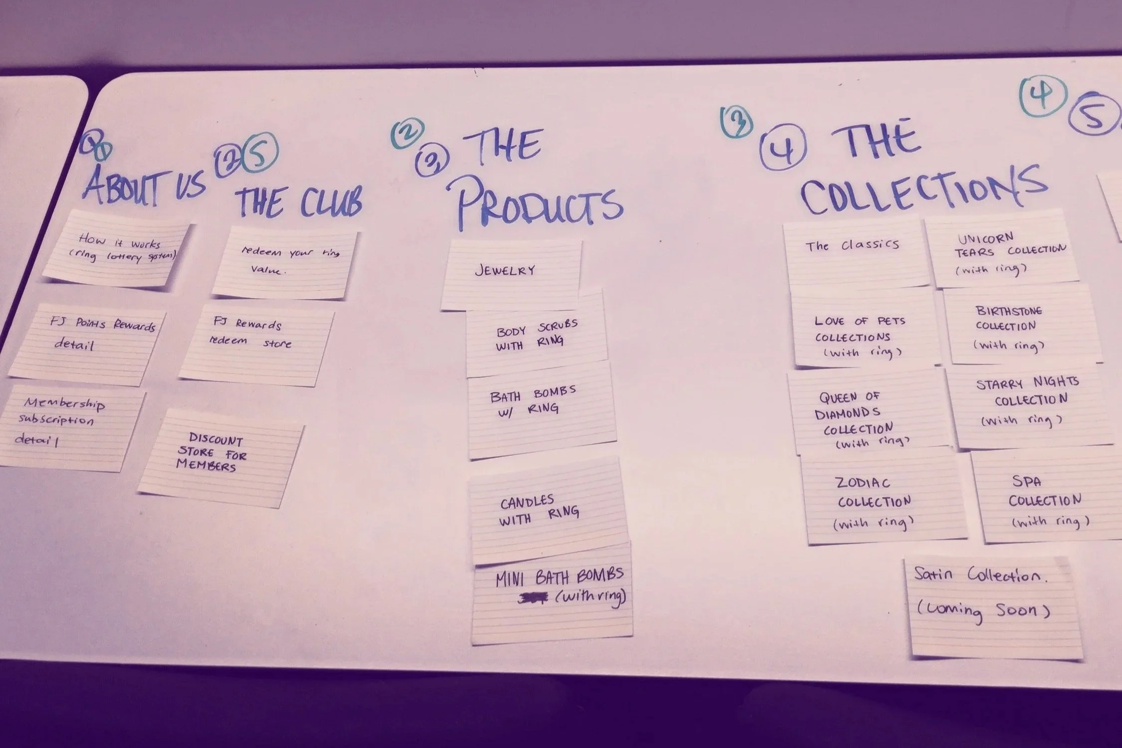
Card sorting with new users. People grouped the site their own way, with no help from us.
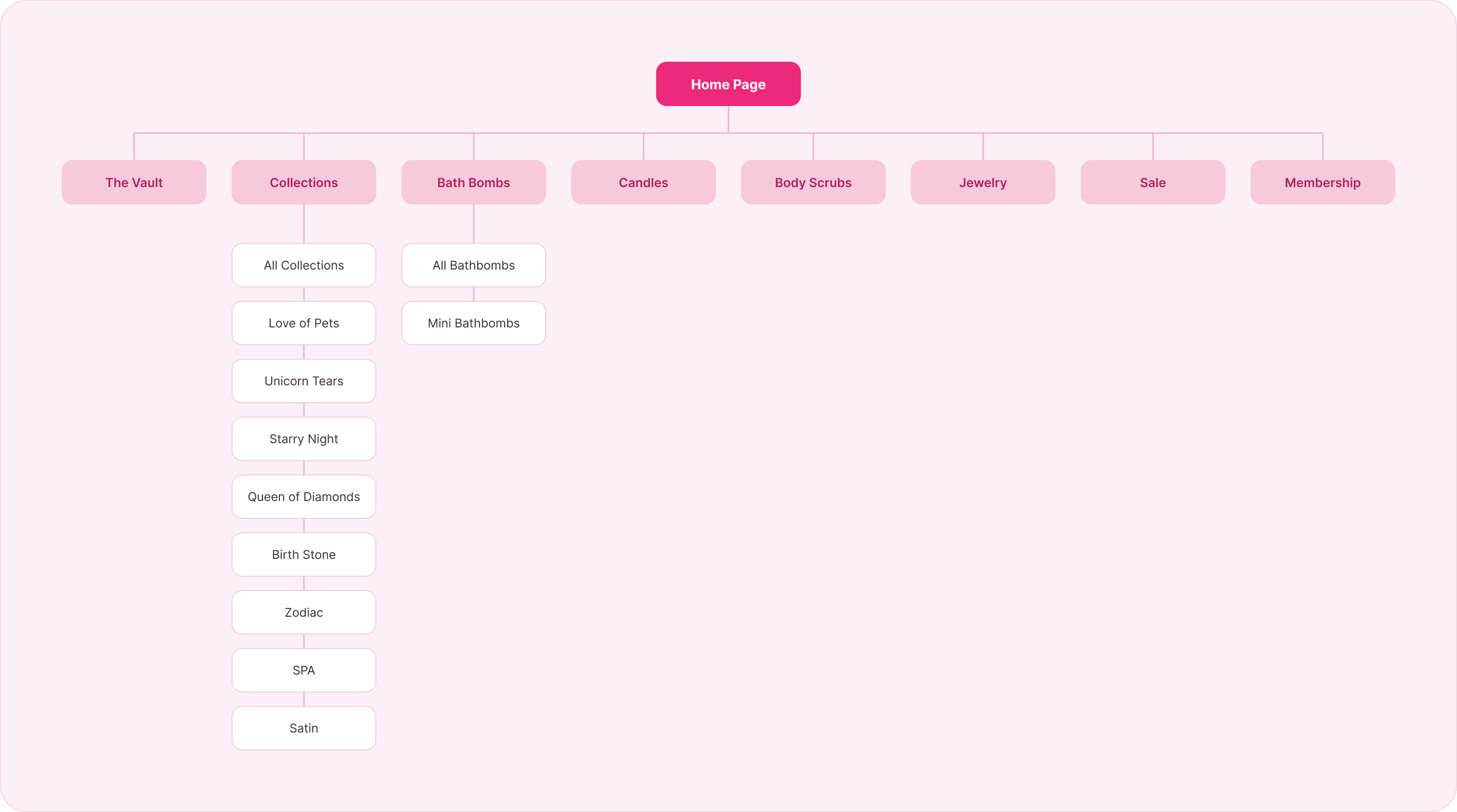
The new site map. Fewer top items, collections grouped under one entry, and the Vault near the top.
05 - Prototyping
From paper to final screens, testing at every step
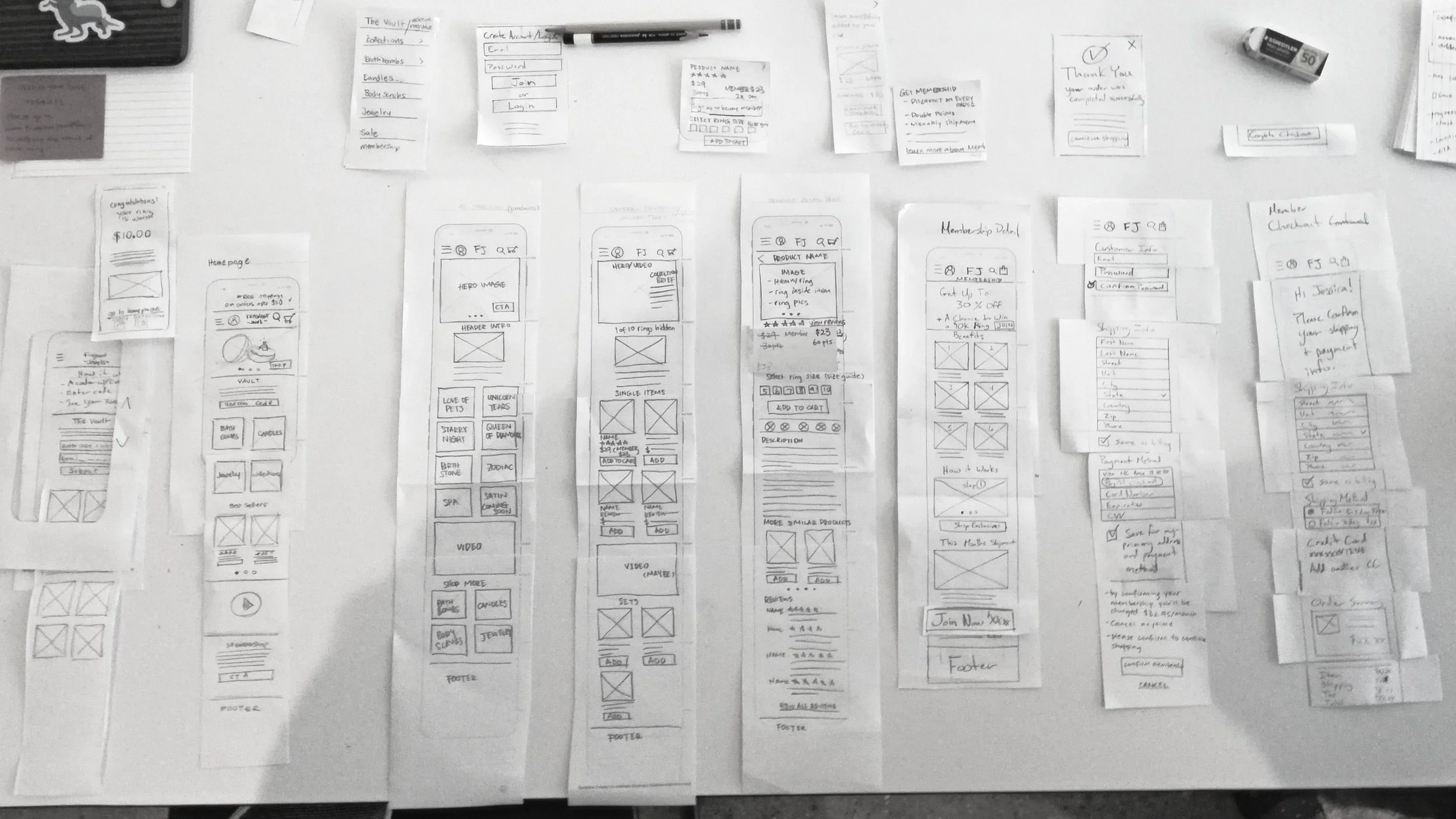
Each stage had a job. Paper prototypes let us check the flow fast, before spending time on visuals. The next stage tested the menu structure and key moments, like the ring reveal and the product page, before adding any brand style. The final stage added the pink look, warm product photos, and finished design for one last round of testing.
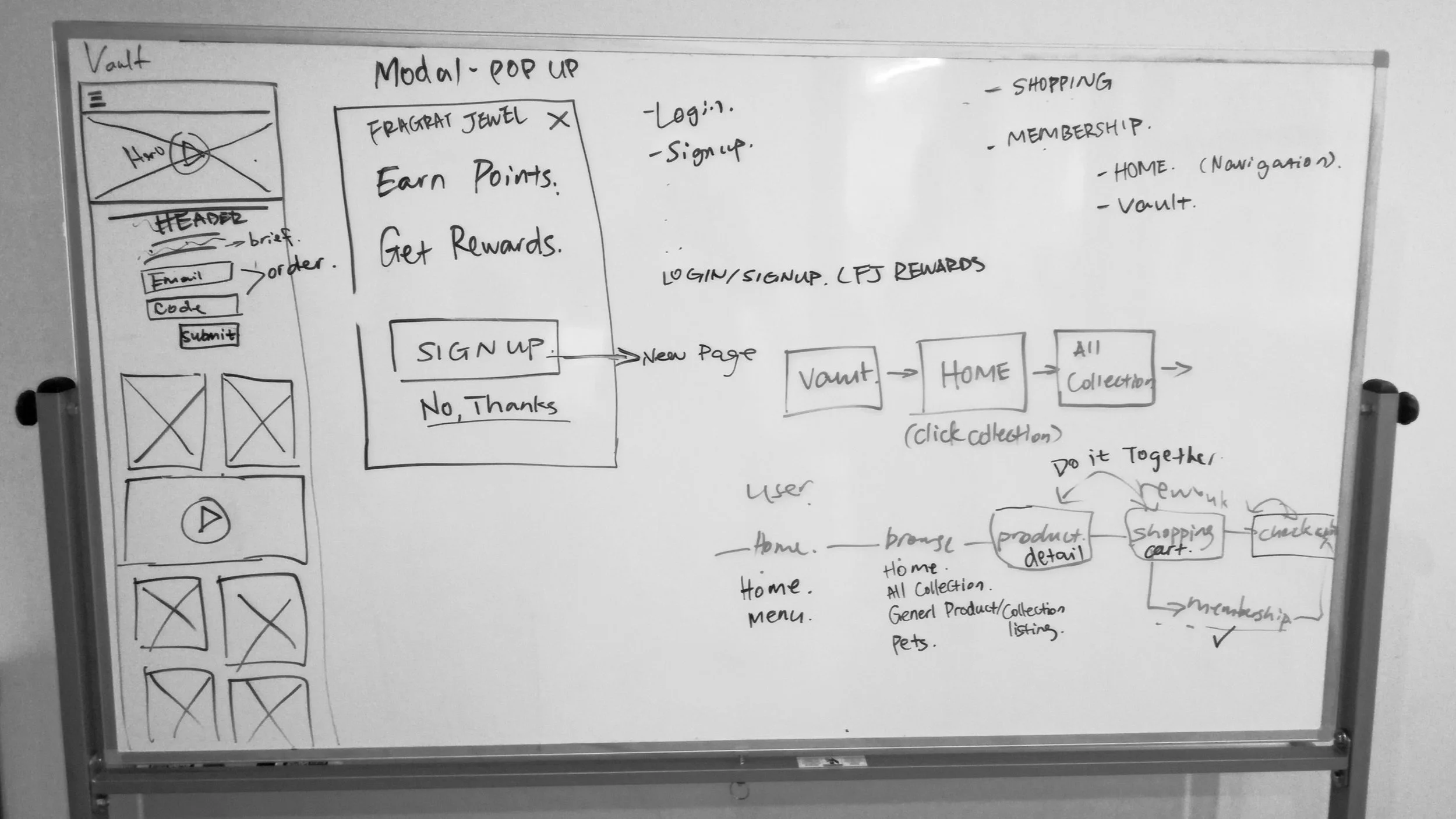
Sketches and user flows
Paper prototypes
These screens map the main paths and the backup paths, plus pop-ups and dropdowns. The notes and arrows show how people move through the site and flag open questions. Laying it out this way made it easy to spot gaps and agree on the flow before final design.
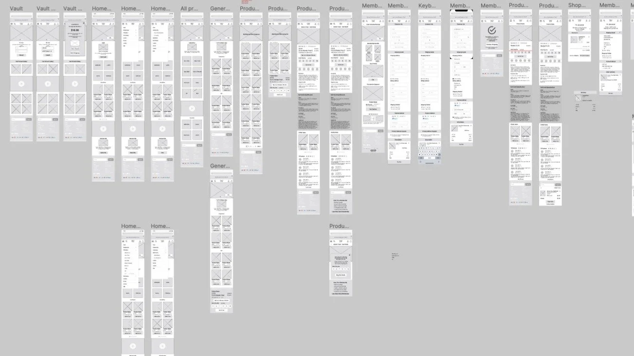
Mid-fidelity screens
05 - Key Design Decision
The new menu set the base. These four changes fixed the exact spots where people got stuck, or where the brand's best moments were going to waste.
Four changes that reshaped the experience
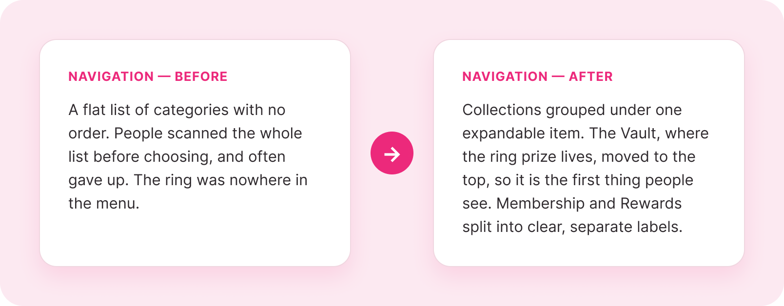
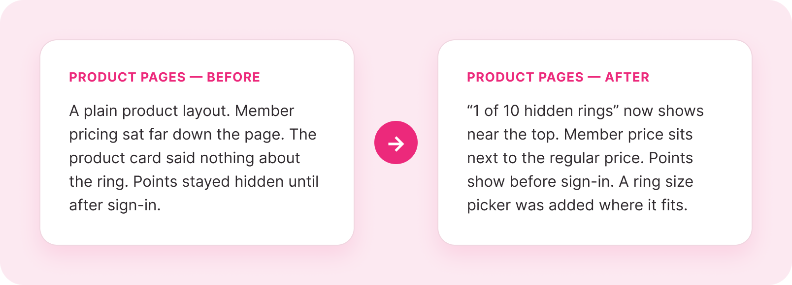
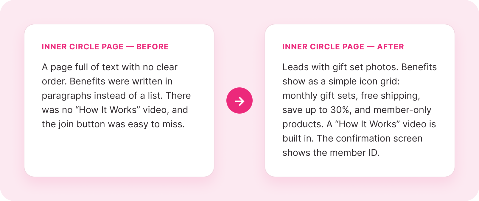
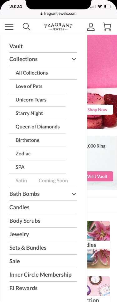
The redesigned menu. Collections collapse under one item and the Vault sits at the top.
07 - Final Screens
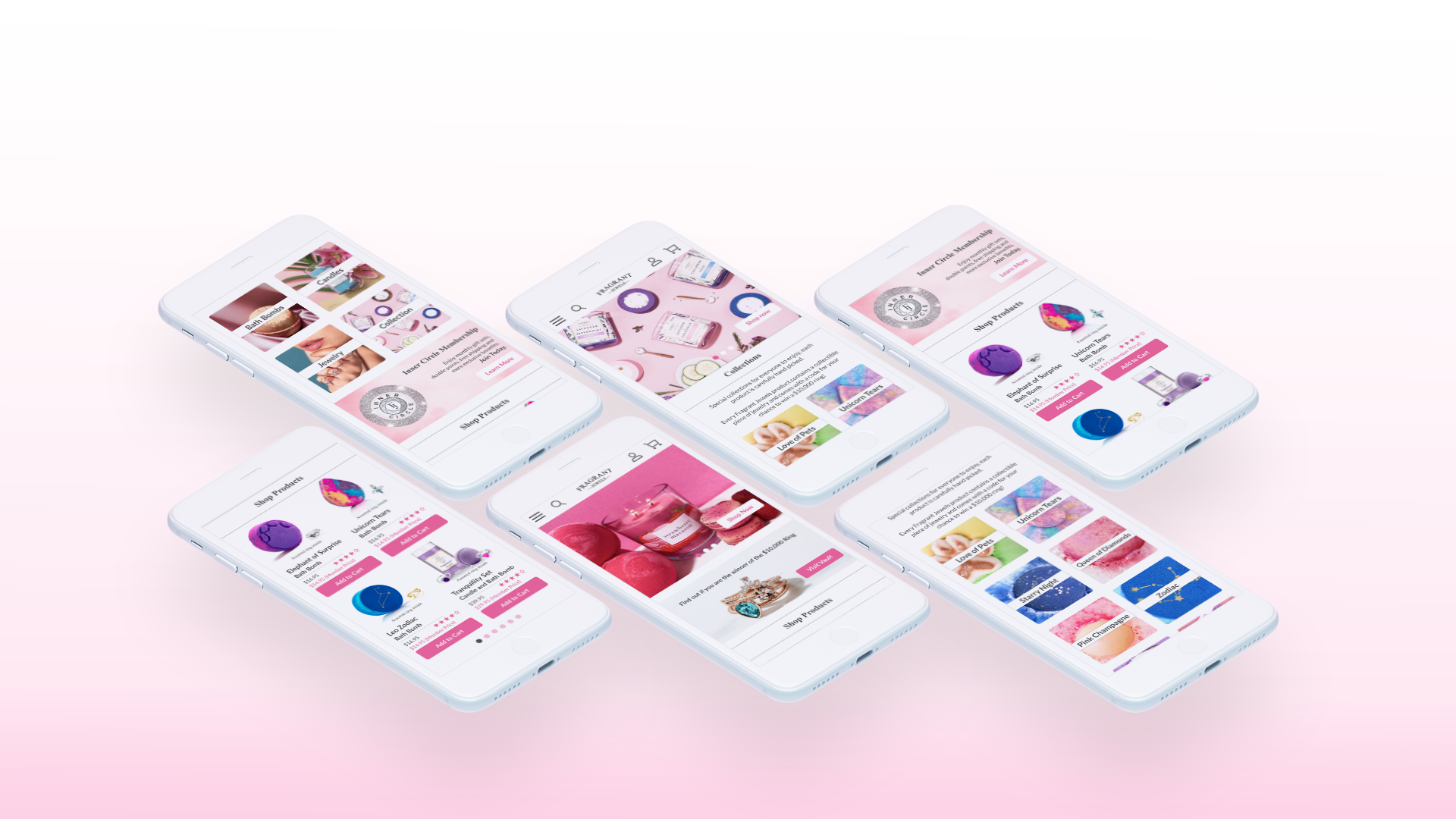
The final mobile experience
The final screens added the pink look, warm product photos, and the icon style. Every screen went through one last round of testing before we handed it over as the main deliverable.
Here is the redesign as a working prototype, from a first visit through to a finished order.
Browse and Discover



Membership and Product
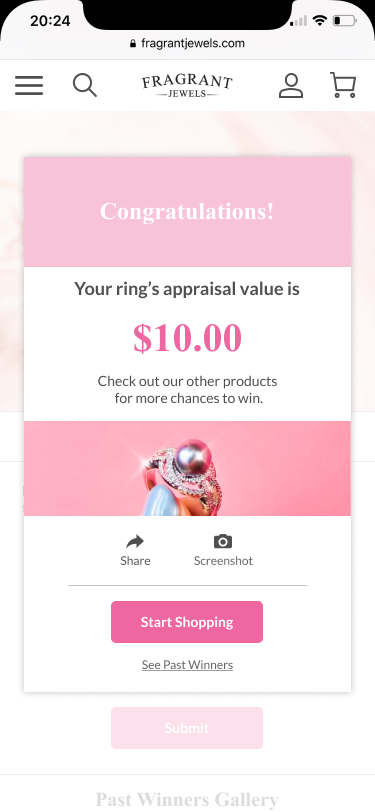
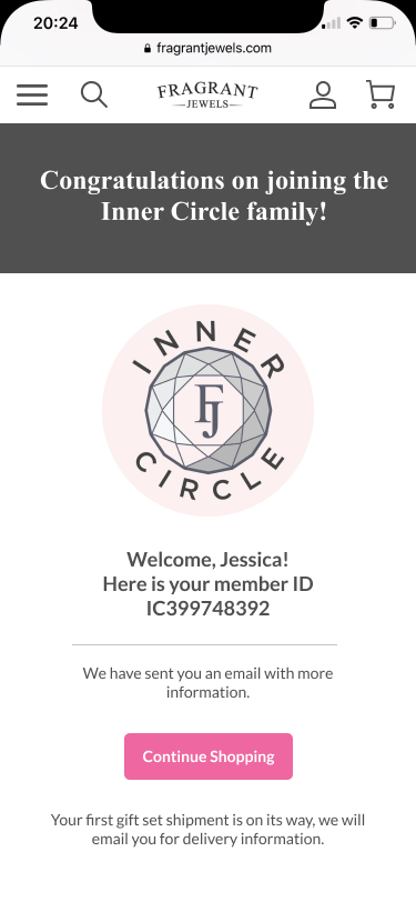
Sign up to a finished order



08 - Validation Plan
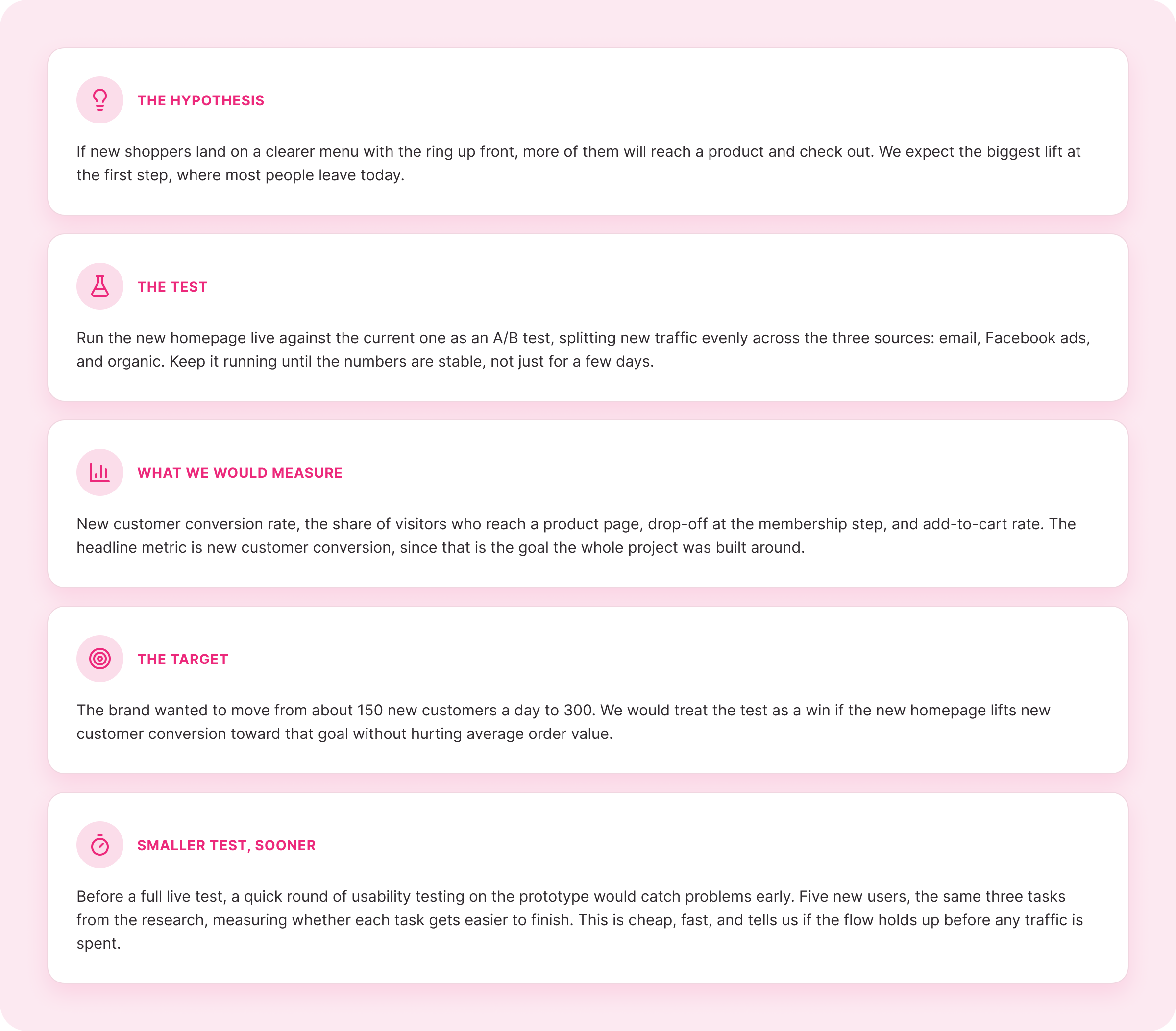
The redesign was built to win more new customers, so the honest next step is to test it before trusting it. This is the plan we handed the client to measure the new mobile homepage against the current one.
How we would prove the redesign works
09 - What we learned and what’s next
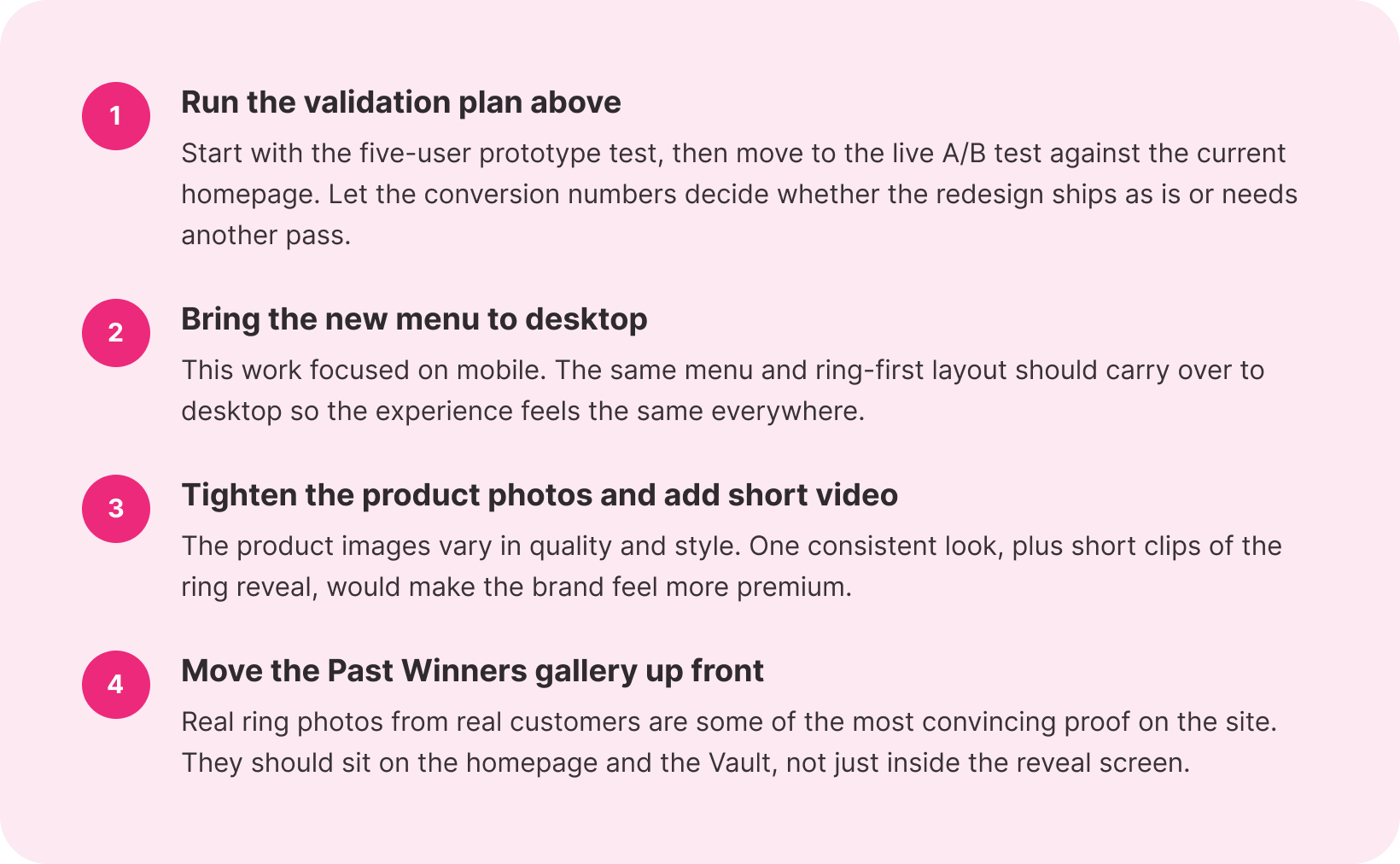
The fix was about focus, not looks
The main lesson was simple. Fragrant Jewels already had a great hook in the hidden ring, but the site buried it. Every choice in the redesign was about putting the ring up front and giving new shoppers a clear reason to stay. We handed the client four next steps: