
BQE CORE • Billing & Invoicing • Product Design
Unifying a fragmented billing experience
Three different layouts. One invoice object. A redesign that gave billing managers a single, consistent mental model — no matter how they accessed an invoice or what state it was in.
Role
Product Designer
Platform
B2B SaaS • AEC Industry
Domain
Billing & Invoicing
Status
Shipped
01 - Overview
About this project
BQE Core is a project management and billing platform used by architecture, engineering, and consulting firms. Invoicing is one of the most critical workflows in the product — billing managers use it daily to review time entries, check phase-level financials, and finalize documents before they reach clients.
The invoice detail screen is where billing decisions get made. Shipping the wrong number on an invoice is not a UX inconvenience — it is a business liability. This project addressed a structural problem hiding in plain sight: the same invoice object looked and behaved completely differently depending on how you accessed it or what state it was in.
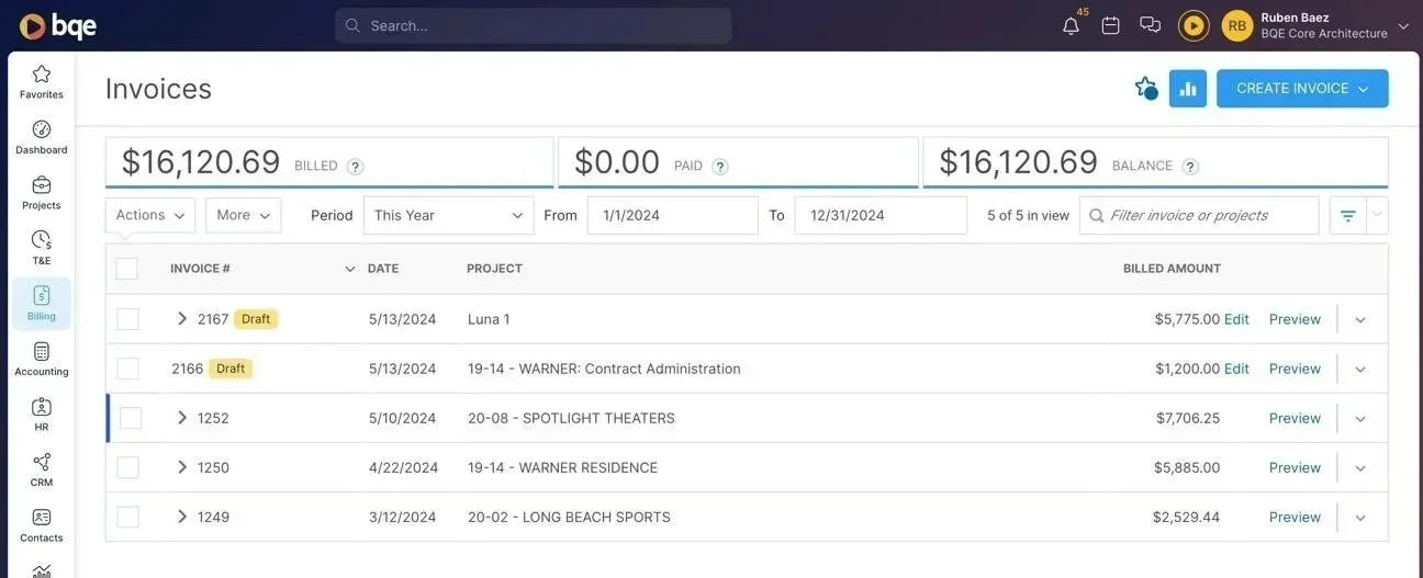
The invoice list - Where every billing session begins
02 - The Problem
Three screens. One Object. Zero consistency
BQE uses Productboard to surface and prioritize user feedback. Confusion around the invoice experience had become a recurring theme — billing managers flagged the inconsistency repeatedly enough that it became a prioritized product initiative. The pattern was clear even without a single dramatic data point: users could feel something was wrong, they just could not name it precisely.
What the screens revealed was a structural fragmentation. The same invoice produced three entirely different page structures depending on context:
Before
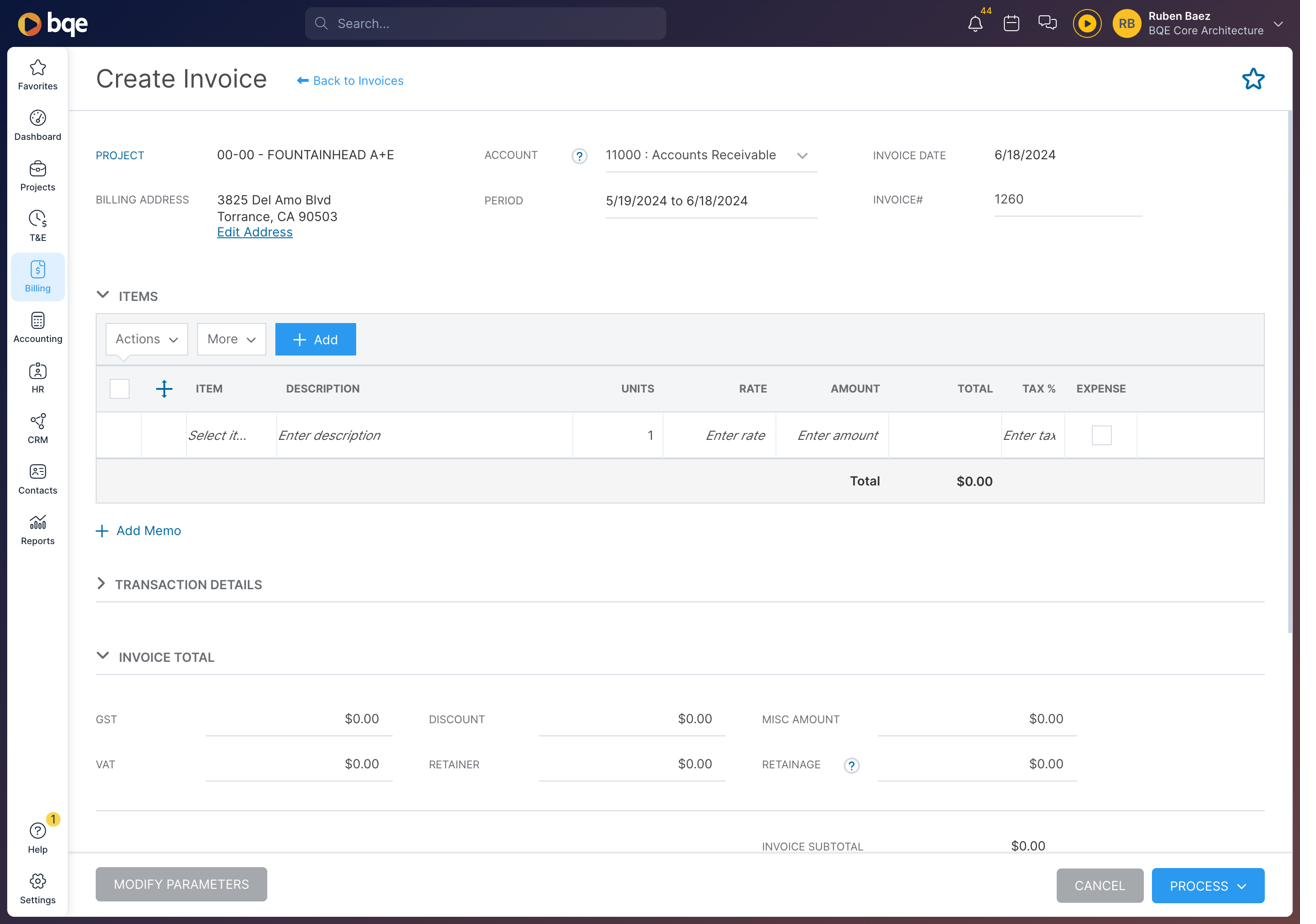
Create State
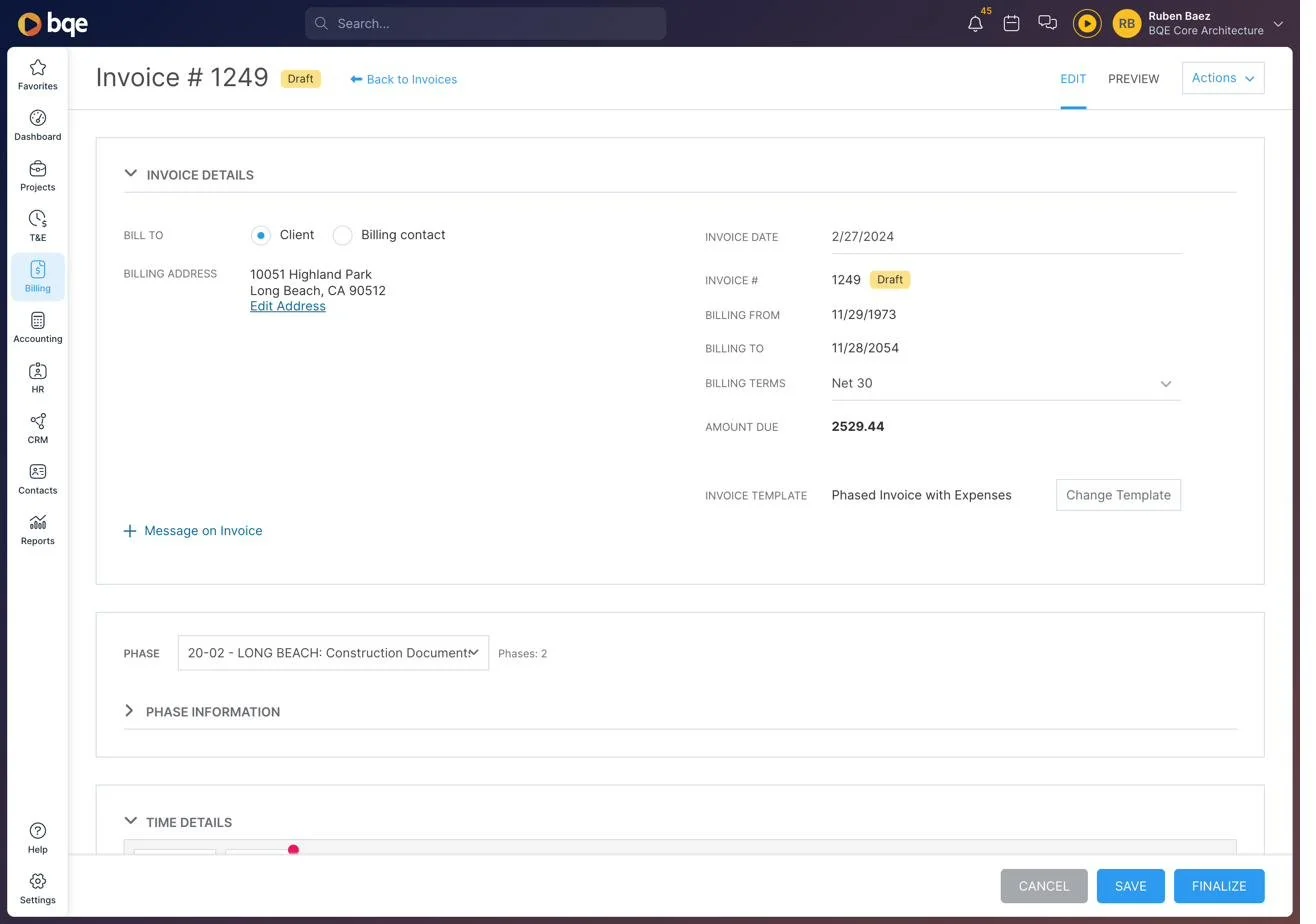
Draft / Edit State
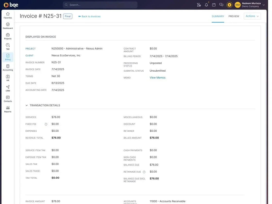
Finalize / Summary State
The core issue: A billing manager switching between a draft and a finalized invoice encountered a completely different layout every time — different tab labels, different section names, different financial field positions, different footer actions. Every context switch required reorientation at exactly the moment when precision mattered most.
In the draft state, financial context was buried beneath collapsible sections. In the finalized state, a dense Transaction Details grid replaced everything. In the create flow, phase-level data did not exist on screen at all. Three structures, zero shared mental model.
03 - The User
Billing managers carry the risk
The primary user is a billing manager at an AEC firm managing dozens of active projects simultaneously — each with multiple phases, different contract types, and varying billing schedules. Their job during invoice review is specific: confirm the right hours are captured for this phase, verify the numbers are correct, and finalize before the invoice reaches the client.
AEC projects are deeply phased — Schematic Design, Design Development, Construction Documents, Contract Administration. Each phase has its own contract amount, its own billing history, and its own time entries. In the old layout, none of that context was visible on the invoice detail screen. You had to navigate away to find it — exactly the kind of interruption that introduces errors when real money is at stake.
The job-to-be-done: Confirm the right hours are billed for this phase, verify the total is correct, and finalize — without opening five other screens to check context that should already be here.
04 - The Solution
One Structure. Every State.
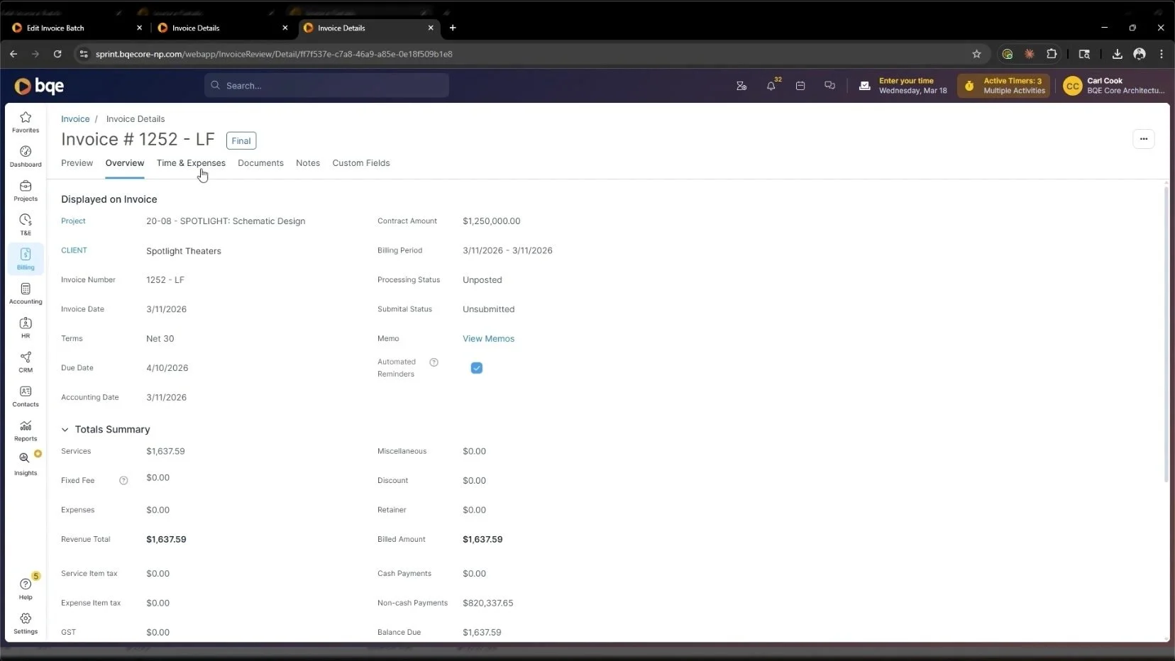
The enhanced Invoice Details page establishes a single, persistent tab structure across all invoice states. Whether the invoice is a draft being edited or a finalized document being reviewed, the header, navigation, and information hierarchy are always in the same place.
The redesign introduced two access contexts that share the same mental model: a slide-over modal that surfaces invoice details without leaving the batch list, and a standalone full page with an expanded tab set. Both use identical navigation structure — the context adapts, the model does not.
Persistent tab navigation across all states
Preview, Overview, and Time & Expenses are always present and always in the same position — whether accessed from a batch or as a standalone page. Billing managers build one mental model and reuse it every session.
Phase context surfaced directly on the invoice
A phase selector sits at the top of the Time & Expenses tab. Billing managers navigate between project phases from within the detail view, seeing contract amount, previously billed, % complete, expenses, and net bill — without leaving the screen. This information was previously unavailable on the invoice detail at all.
Totals / Subtotals / Analysis sub-views
Within the Phase Information card, three sub-tabs offer different financial perspectives. Billing managers toggle between aggregate totals, phase subtotals, and performance analysis without losing their place in the entry review flow.
Real-time net bill recalculation
When a time entry is excluded or the net bill is manually adjusted, the figure updates immediately. This is a critical trust signal — the number on screen always reflects the current state. In the old layout, totals were static and gave no feedback on the impact of individual changes.
Contextual tab expansion
The standalone page adds Documents, Notes, and Custom Fields — capabilities needed when working deeply on a single invoice, not during a batch review session. The information architecture adapts to the task without fracturing the mental model.
Skeleton loading states
Both the modal and standalone page use shimmer placeholder states during data loading. The layout stays spatially intact while data resolves — users maintain orientation instead of losing their place. Visible on every tab switch in the video walkthrough.
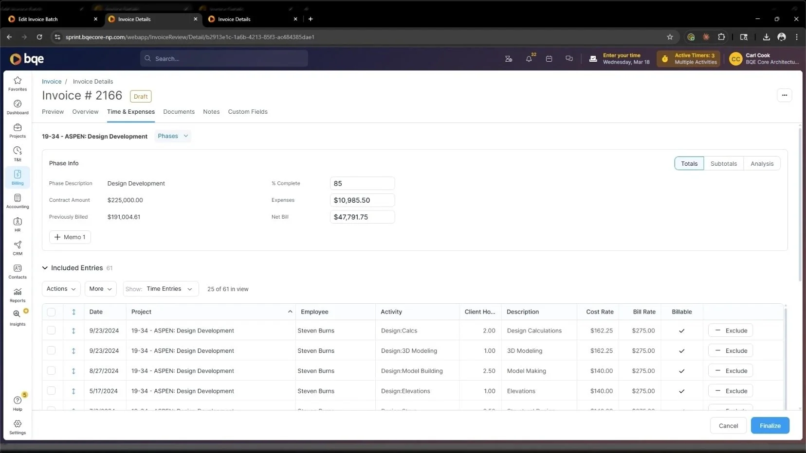
After • Draft Invoice
Real-time net bill recalculation — one of the most critical moments in the video. When entries are adjusted, the net bill updates immediately. The number on screen always reflects the current state of the invoice.
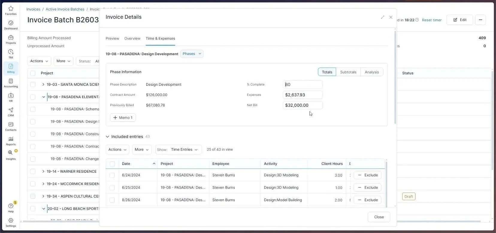
Net Bill Before - $32,000.00
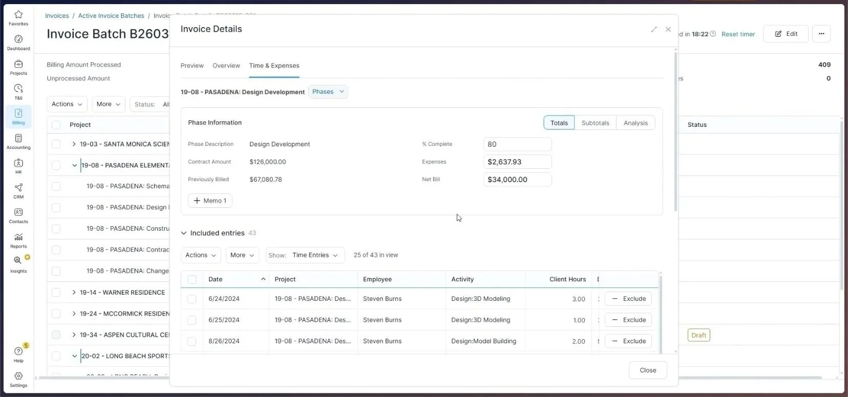
Net Bill After - $34,000.00
The invoice detail screen is where billing errors either get caught or get shipped to clients. Designing for that moment means designing for clarity under time pressure — not just aesthetics.
05 - Before - After
What changed, and why it matters
Before
Three completely different page structures depending on invoice state. No shared tab navigation. Billing managers had to relearn the layout on every context switch.
After
One persistent tab structure across Draft and Final states. Same navigation, same hierarchy, same mental model — every time, regardless of entry point.
Before
Phase financial data — contract amount, previously billed, net bill — required navigating away from the invoice. Not visible on the detail screen at all.
After
Phase context surfaced directly on the invoice via a phase selector. All key figures visible without leaving the screen. Previously billed, contract amount, net bill — all in one place.
Before
Invoice totals were static. Excluding a time entry gave no visible feedback on how the invoice amount changed. Billing managers had to recalculate mentally.
After
Net Bill recalculates in real time as entries are toggled or adjusted — confirmed live in the video walkthrough ($32,000 → $34,000). The total always reflects the current state
Before
Loading spinners masked layout structure during tab switches, causing visual disorientation on every tab change.
After
Skeleton shimmer states preserve the spatial layout during loading. Users maintain orientation while data resolves.
Before
Reviewing an invoice required leaving the batch list entirely, losing context of which invoices had been reviewed.
After
A slide-over modal surfaces invoice details without leaving the batch list. Billing managers review multiple invoices in sequence without losing their place.
04 - Reflection
What I’d push further
No shipped product is the final word. Looking at this design critically, there are areas worth continuing to explore:
The Overview tab is information-dense
Fourteen or more data points in a two-column grid. A persistent summary bar showing the three most critical numbers — Balance Due, Days Past Due, Previously Billed — could meaningfully reduce time-to-decision for high-volume billing sessions without a scroll or tab switch.
The Exclude button needs more affordance
For an action that directly changes the invoice total, the current Exclude button is small and easy to miss. Stronger visual weight — or an undo pattern — would reduce the anxiety of making accidental changes to a financial document.
No visible empty state for the phase selector
A project with no phases would produce a confusing dead end. A clear fallback state or explanatory message would prevent that edge case from becoming a support ticket.
Mobile and tablet are unaddressed
AEC billing managers increasingly review invoices on tablets in the field. The Phase Information card and entry table are dense enough that a responsive adaptation would be a meaningful next design conversation.