Fragrant Jewels • E-Commerce UX • Mobile Design
Restructuring a loyalty experience customers couldn't navigate
Users were dropping off before checkout — not because the product wasn't compelling, but because the site made it impossible to understand what they were buying into. A research-driven IA overhaul, from card sorting through hi-fi delivery.
Role
UX Designer
Platform
Mobile Wed • E-Commerce
Methods
Research • Card Sort • Prototyping
Deliverable
Hi-Fidelity mobile screens
01 - Overview
A compelling product mechanic buried under a confusing site
Fragrant Jewels is an e-commerce brand selling candles, bath bombs, and body scrubs — each product hiding a ring worth anywhere from $10 to $10,000. The excitement of the ring reveal is the brand's core hook. They also offer two loyalty programs: FJ Rewards (a points system) and Inner Circle (a monthly subscription with gift sets and member pricing).
The problem was structural. New users couldn't find what they were looking for, couldn't understand the difference between the two membership programs, and were leaving before they could experience the product mechanic that makes the brand unique. The ring was the story — the site buried it.
Problem
Low adoption of Rewards and Inner Circle. Users confused by navigation and unable to distinguish between programs. The ring mechanic — the brand's biggest differentiator — was not surfaced as a primary value proposition.
Solution
Restructure the IA so new users can navigate from entry to checkout without friction. Clearly differentiate Rewards from Inner Circle. Surface the ring mechanic as the primary value proposition throughout the mobile experience.
02 - Research
I conducted 1-on-1 interviews and user testing sessions with new users — people with no prior exposure to the Fragrant Jewels brand. Participants were given three tasks designed to expose where the site broke down: purchase a specific bath bomb, sign up for the FJ Rewards program, and subscribe to an Inner Circle membership.
Three tasks. Three points of failure.
Every participant struggled with at least two of the three. The same three failure themes appeared in every session.
"I am getting frustrated trying to find the bath bomb that I need."
"The membership and point system are confusing. How do they work? What is the difference between the two?"
"This site looks very overwhelming and unorganized."
03 - Information Architecture
Card sorting revealed the nav had too many top-level categories
The original navigation exposed every product type, collection, and program as a separate top-level item. Users were overwhelmed before they could commit to any path. Card sorting sessions let participants organise site content in a way that made sense to them — without coaching
A clear pattern emerged after several rounds: the main menu needed to collapse to fewer categories. Users consistently grouped collections under a single entry, expected to find membership and rewards in separate places, and wanted the ring mechanic visible from the top level
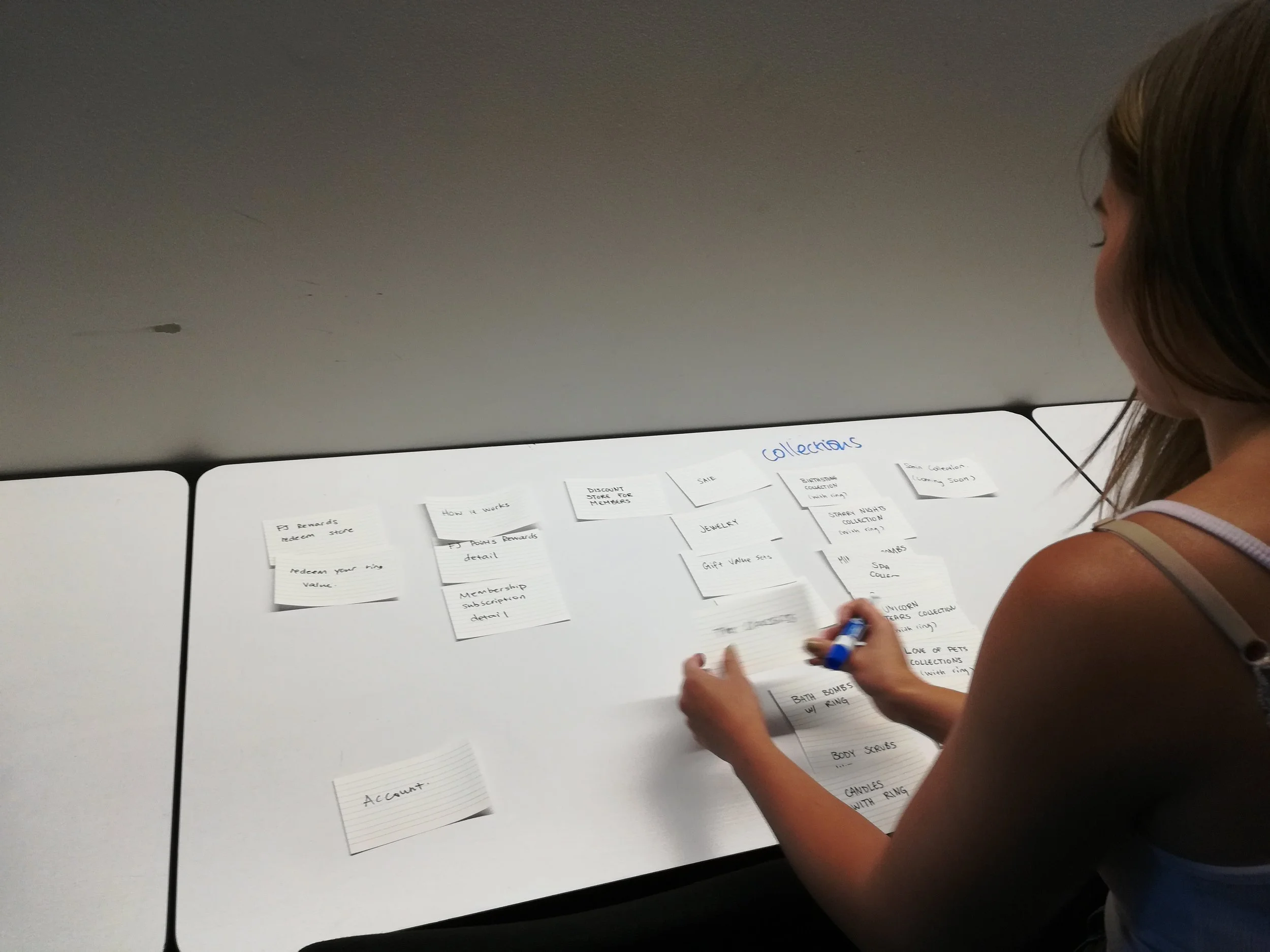
Card sort sessions informed how categories should be grouped and prioritised in the nav
Before
Eight or more top-level nav items — Bath Bombs, Candles, Scrubs, Jewelry, Inner Circle Membership, FJ Rewards, Sale, and more — at the same visual weight. No clear entry point.
After
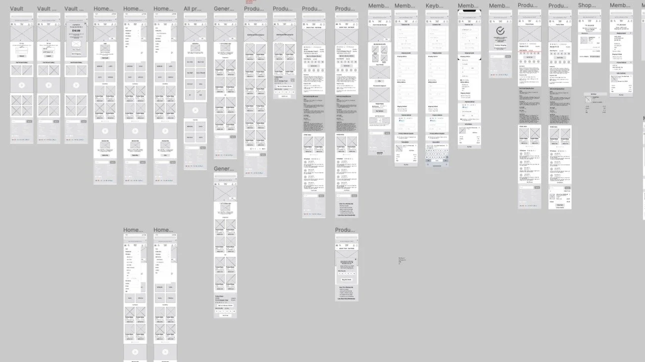
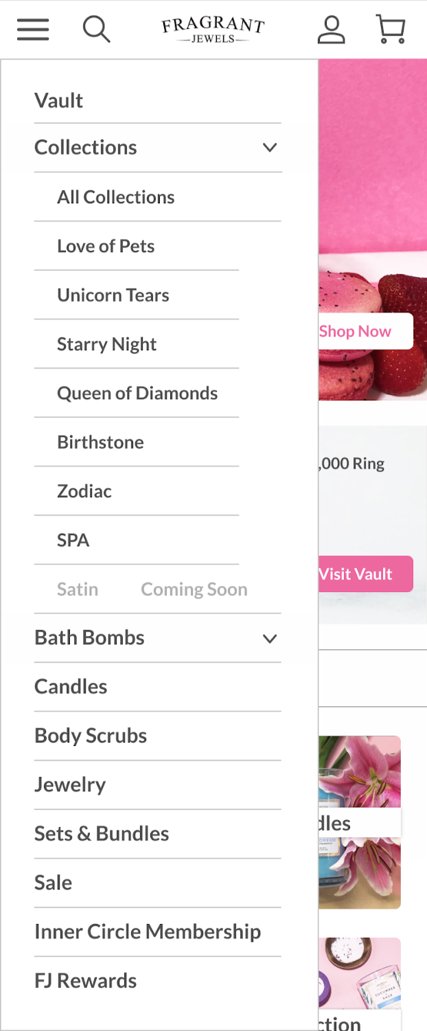
Five top-level items: Vault, Collections (grouped), Bath Bombs, Candles, Scrubs, Jewelry — with Inner Circle and FJ Rewards clearly separated. The Vault promoted to top nav and homepage CTA.
Before
Inner Circle Membership and FJ Rewards listed adjacently with no visual distinction. Users couldn't tell if they were the same program or different ones.
After
Membership and Rewards given distinct IA positions and landing pages with clear differentiation. Inner Circle leads with gift set imagery and monthly value; FJ Rewards leads with points and earning.
04 - Prototyping
Paper to mid-fi to hi-fi — testing at every stage
Each fidelity level served a specific purpose. Paper prototypes validated the flow quickly without visual investment. Mid-fi tested the IA structure and key interactions — nav hierarchy, ring reveal modal, product page layout — before introducing brand visuals. Hi-fi brought in the pink palette, warm photography, and final component design for a last round of usability testing.
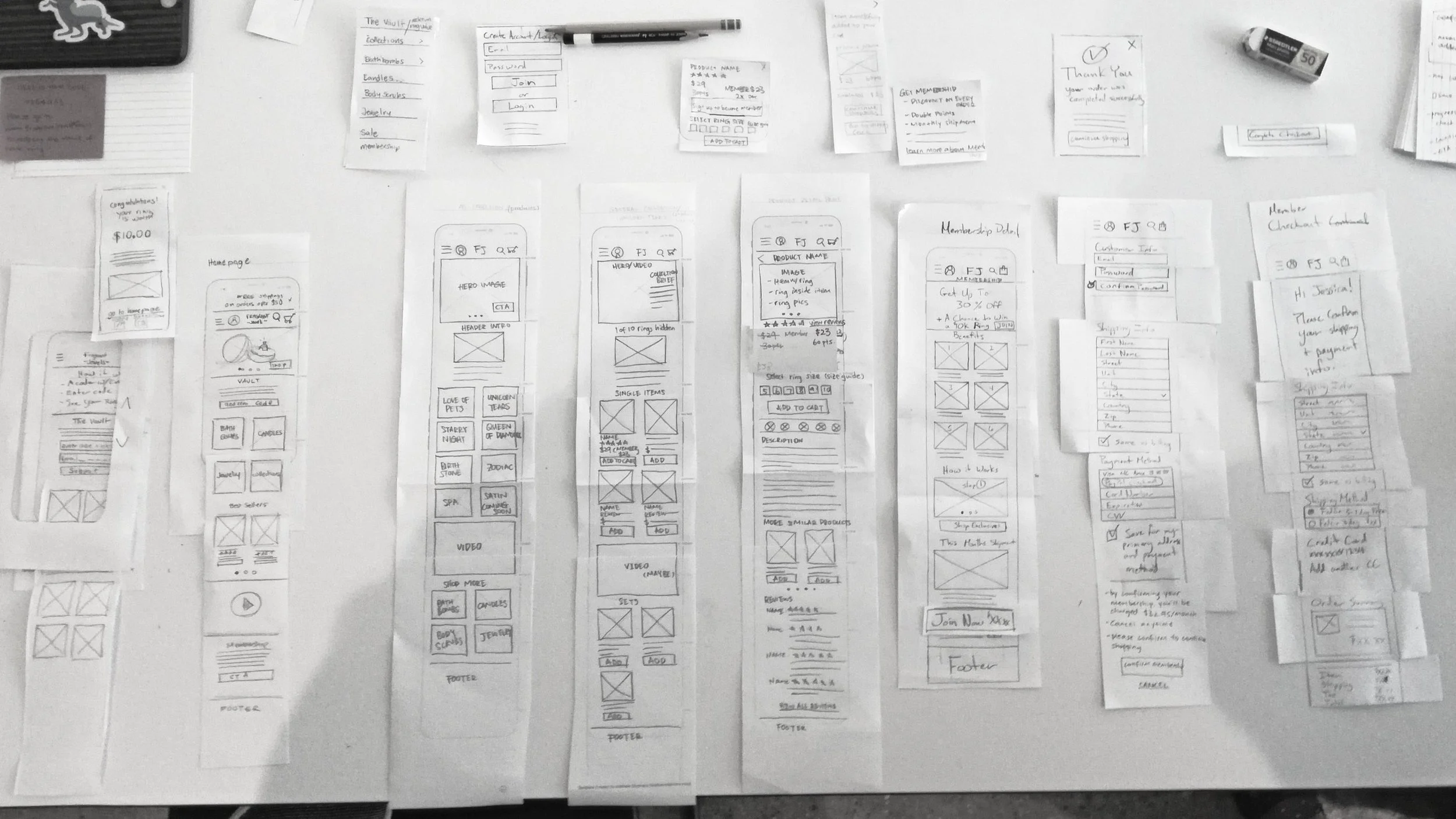
Full paper prototype spread — the complete mobile flow mapped before any digital work began
Digital screens: Displays key flow variants (happy/alternate) and layered elements (modals, dropdowns, progressive disclosure). Arrows/numbered notes map navigation, branches, edge cases; sticky notes flag open decisions and usability questions. Easily rearranged for rapid iteration; validates flows, reveals gaps, and aligns stakeholders before design or engineering.
05 - Key Design Decision
The IA restructure set the foundation. These four design decisions addressed the specific moments where users were failing — or where the brand's strongest mechanics were being underused.
Four changes that redefined the experience
Navigation - Before
Flat list of categories with no visual hierarchy. Users scanned the entire list before deciding — and often gave up. The ring mechanic was not visible at the nav level.
Navigation - After
Collections grouped under a single expandable entry. Vault promoted to the top of the nav — the first item a user sees. Membership and Rewards clearly separated with distinct labels.
Ring Reveal Modal - Before
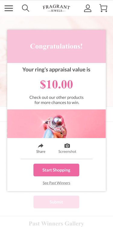
The ring reveal happened after purchase but the confirmation state was understated. The appraised value was not prominently displayed, and sharing was not prompted.
Ring Reveal Modal - Before
Congratulations state leads with the appraised value at large type. Share and Screenshot actions prominently offered. "You might be the next winner of a $10,000 ring" added as a social hook.
Product Pages - Before
Standard e-commerce layout. Member pricing buried below the fold. No mention of the ring mechanic on the product card. Points value not visible until after login.
Product Pages - After
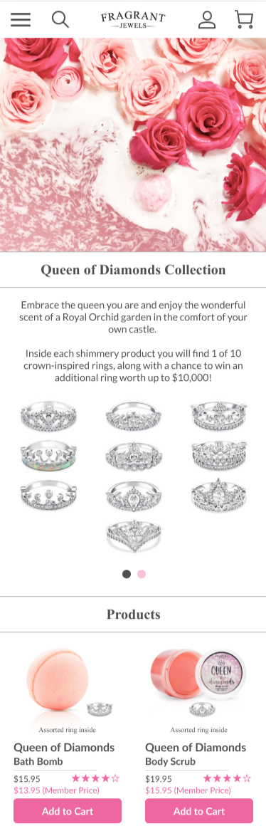
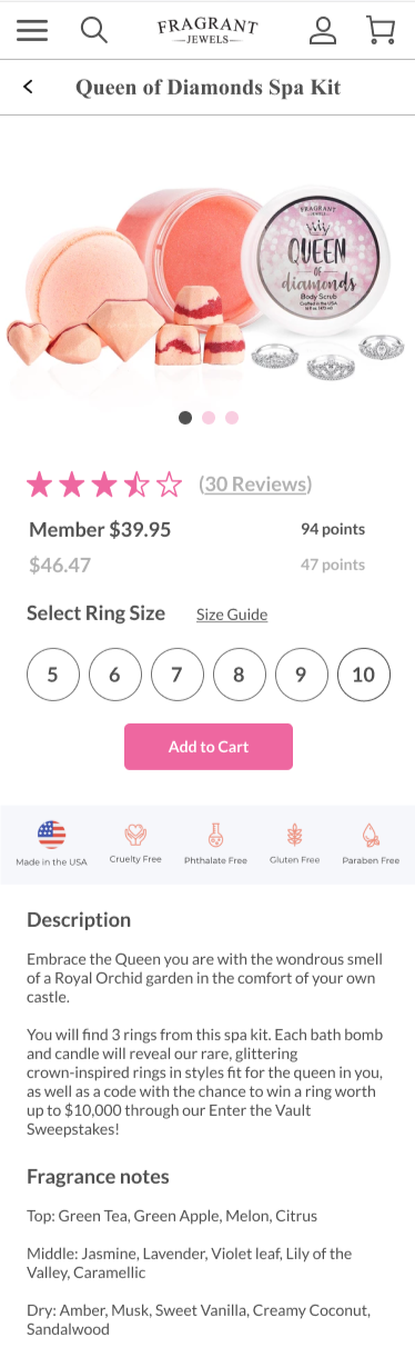
"1 of 10 hidden rings" surfaced above the fold. Member price shown alongside standard price. Points value visible before login. Ring size selector added where applicable.
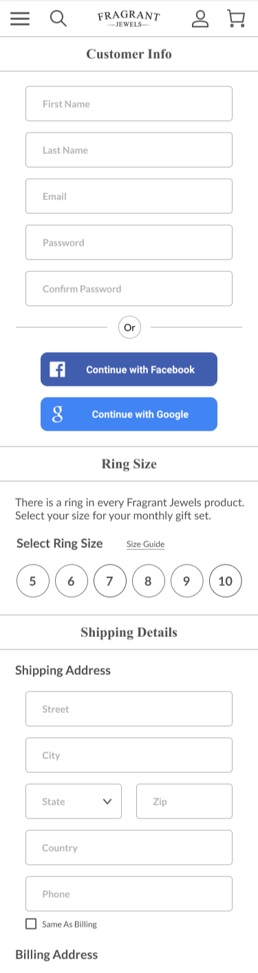
Inner Circle Page - Before
Text-heavy page with no strong visual hierarchy. Benefits listed in prose rather than scannable format. No "How It Works" video. Subscription CTA not prominent.
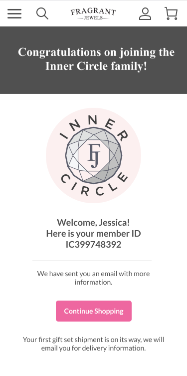
Inner Circle Page - After
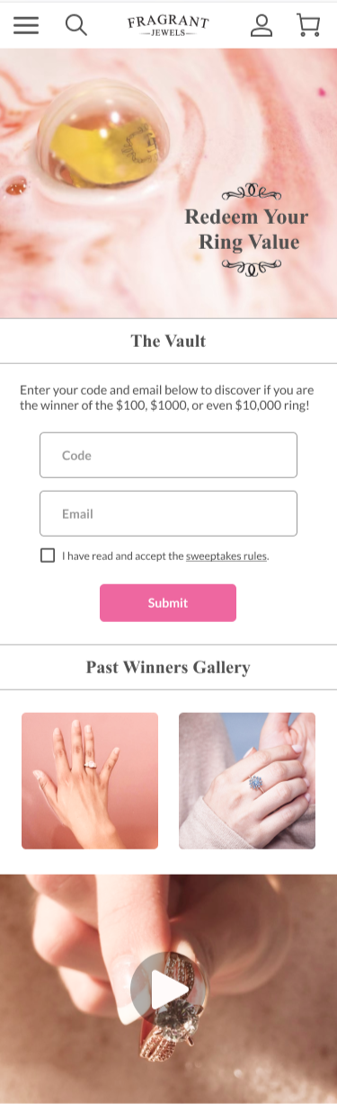
Leads with gift set photography. Benefits shown as icon grid: Monthly Gift Sets, Free Shipping, Save Up to 30%, Exclusive Products. "How It Works" video embedded. Membership confirmation screen includes member ID.
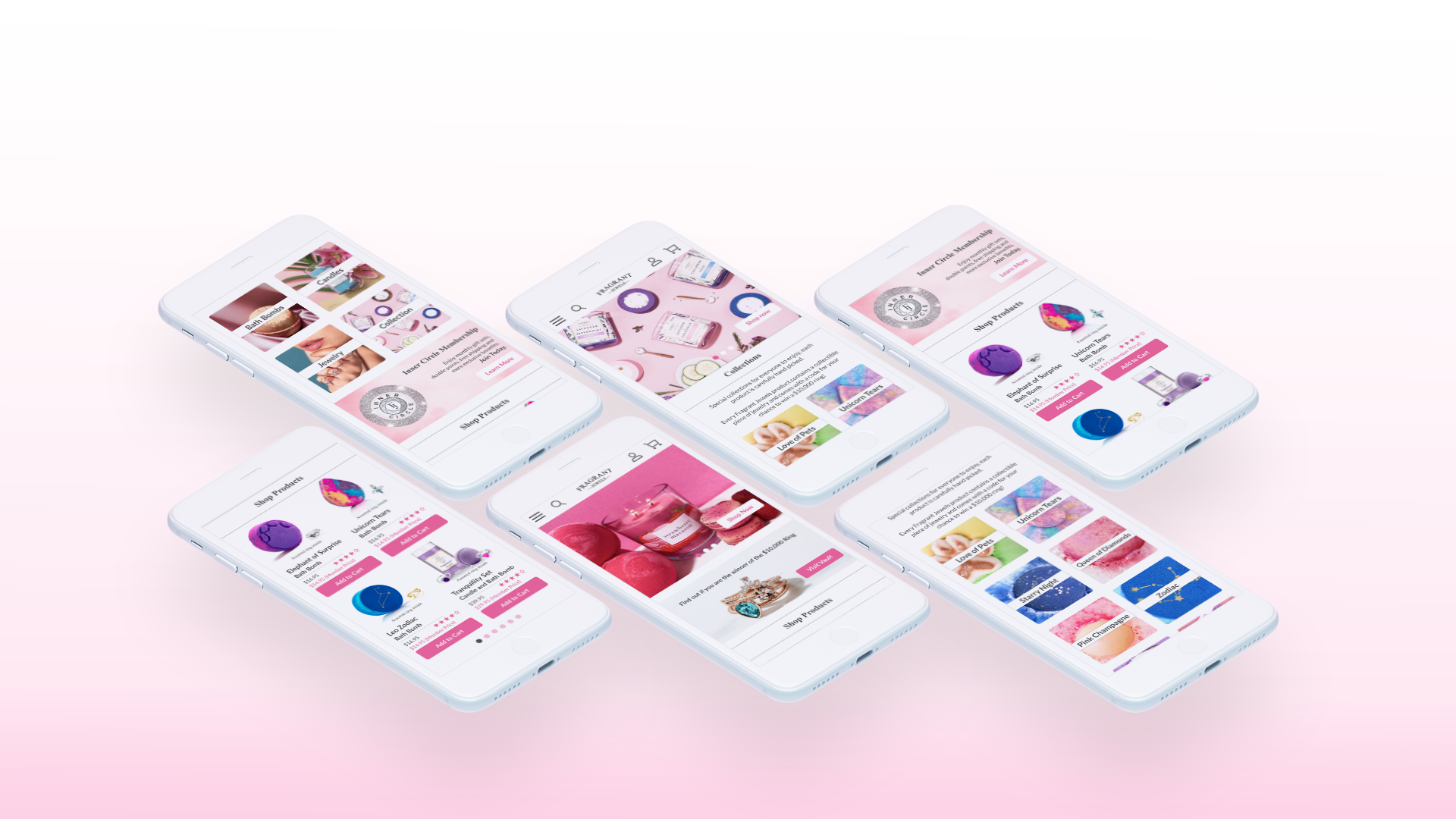
06 - Hi - Fidelity Screens
Brand, motion, and the final mobile experience
Hi-fidelity introduced the pink palette, warm product photography, and the icon language. Every screen went through one final round of usability testing before being delivered as the project's primary design artifact.
-
![]()
Homepage with Vault CTA and shop grid.
-
![]()
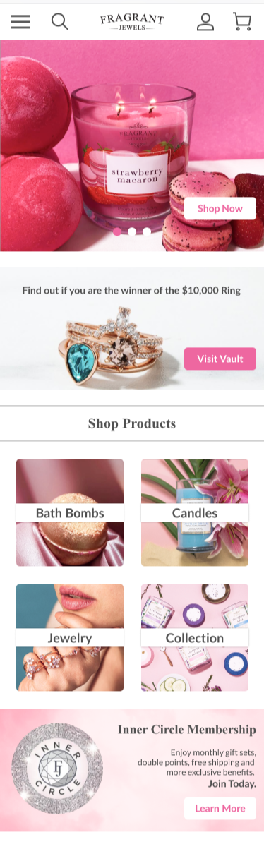
Vault code entry and Past Winners Gallery.
-
![]()
Inner Circle membership with benefit icons and How It Works video.
-
![]()
Redesigned hamburger nav with Vault at top.
-
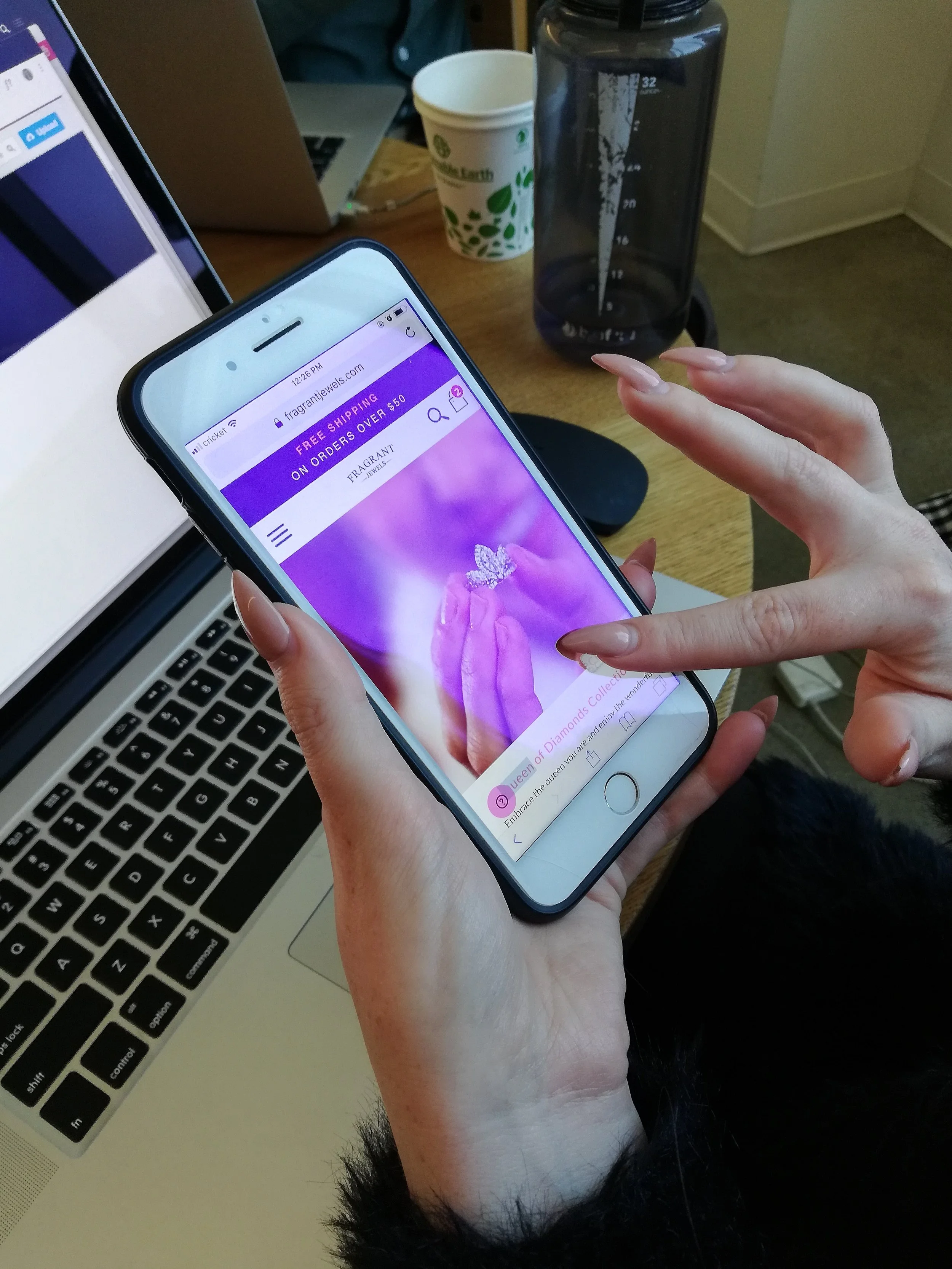
![]()
ring reveal congratulations state with appraised value.
-
![]()
Queen of Diamonds collection page showing ring options and member pricing.
-
![]()
Final screens: ring congratulations with share/screenshot.
-
![]()
Queen of Diamonds product checkout.
-
![]()
Inner Circle welcome with member ID.
07 - Reflection
The core insight from this project was about framing, not aesthetics. Fragrant Jewels had a genuinely compelling product mechanic — the hidden ring — but the site treated it like a footnote. Every structural decision in the redesign was about elevating that mechanic and giving first-time users a reason to stay.
Testing validated the IA restructure. Users navigated the new structure significantly faster and reported higher confidence in understanding the difference between Inner Circle and FJ Rewards. The ring reveal modal in particular performed well — participants responded strongly to the congratulations state and the social sharing prompt.
Several things remained out of scope that would meaningfully extend the impact of this work:
What worked - and what comes next.
Testing with existing members
All usability testing was conducted with new users. A second round with existing Inner Circle members and FJ Rewards participants would validate whether the redesigned programs feel like improvements to people who already understand the current system — and flag any breakage in familiar flows.
Desktop adaptation
The hi-fidelity work was scoped to mobile. Applying the new IA and visual system to desktop — where the nav restructure and ring reveal modal would behave quite differently in a wider viewport — is the logical next design conversation.
Product photography and video
The current product imagery varies in quality and style. A cohesive art direction — consistent lighting, consistent ring photography, short unboxing hint clips — would meaningfully strengthen the premium feel the redesign is trying to establish.
Past Winners Gallery as social proof
Social proof is unusually strong in this product category. Seeing real ring photos from real customers is one of the most persuasive things on the site. The Gallery should be higher in the hierarchy — surfaced on the homepage and the Vault, not only inside the ring reveal flow.
08 - Reflection
A note on this case study.
This project was a UX design engagement focused on Fragrant Jewels' mobile web experience. Research was conducted with new users who had no prior exposure to the brand. Card sorting sessions directly informed the IA restructure. Paper, mid-fi, and hi-fi prototypes were each tested with participants before advancing to the next fidelity level.
The hi-fidelity screens shown here represent the final deliverables from the engagement — the redesigned mobile experience as it was designed to be built. Recommendations for desktop adaptation, art direction, and further member testing were documented as next steps for the client.
The design challenge here was one of framing, not aesthetics. Fragrant Jewels had a genuinely compelling product mechanic — the hidden ring — but the site treated it as a footnote. The redesign's primary job was structural: elevate the mechanic, simplify the path to membership, and reduce the cognitive load of understanding what you're buying before you commit.