Melrose Trading Post • Website Redesign
Fixing a flea market that forgot its users
Role
UI/UX Designer
Context
Bootcamp Capstone
Timeline
2 Weeks
Tools
Sketch • Figma
01 - Context
A beloved market with a website that worked against it
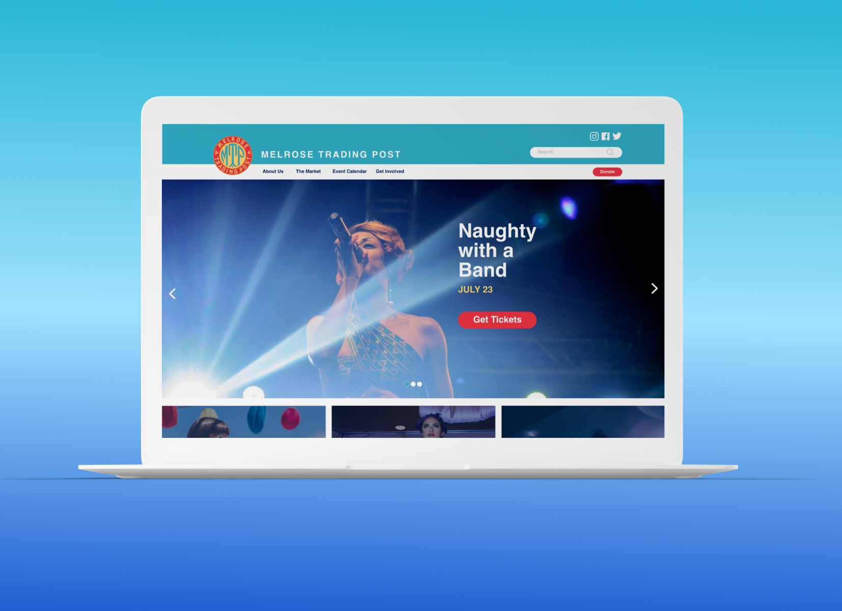
Melrose Trading Post is a weekly outdoor market and event venue in West Hollywood — vintage finds, live music, local vendors. The website told a very different story
The site had chaotic navigation, an event-booking flow that more than half of users couldn't complete, and brand visuals that didn't communicate the energy of the place. Ticket sales for performances were the direct casualty.
52%
Of 25 survey participants failed to add a ticket to cart
7→4
Primary nav items reduced from 7 to 4 clear categories
9→5
Total navigation categories collapsed via card sorting
2 weeks
Full process research > synthesis > IA > Prototyping > Testing
02 - Research
I didn't guess at the problems. Heuristic evaluation, a quantitative survey, and user interviews ran in parallel to build a multi-layered picture of where the site was breaking down.
Three methods. One clear diagnosis
Heuristic Evaluation - Nielsen’s 10 Principles
I evaluated every screen of the current site against Nielsen's heuristics, rating each issue by severity. Three Severity 4 issues emerged immediately — catastrophic problems that would block almost any user from completing their primary goal.
The through-line: the site was designed around the organization's structure, not the user's mental model. Categories like "Participate" made sense internally but were opaque to someone who just wanted to attend a show.
4
Catastrophic before launch
No clear way to navigate the site from the home page
Events can only be booked through one single confusing path
Users cannot backtrack from a non-existent event page
3
Major - High Priority
Home page doesn't clearly show what events are available
It takes excessive effort to find and access events
2
Minor - Fix if time allows
No shortcuts or accelerators for returning users who know what they want
1
Cosmetic - Fix last
Visual inconsistency in typography and brand treatment across pages
Online Survey - 52% failure rate
25 people were asked to navigate the current site and add an event to their cart. This is the site's primary user goal. Just over half couldn't do it.
That single number justified the entire redesign effort. This wasn't a cosmetic problem — it was a structural one.
Card Sorting - 9 categories were brought down to 5
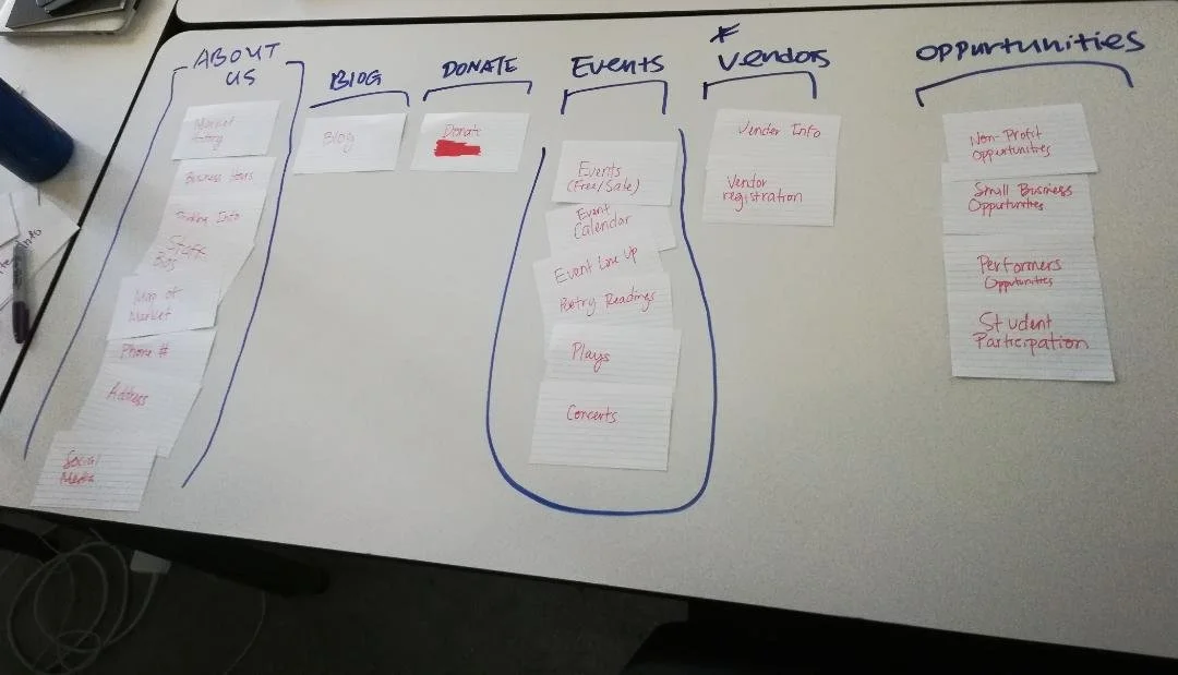
Open sorting let users group the existing navigation however felt natural. Without prompting, they collapsed 9 categories into 5. Closed sorting confirmed the groupings and validated the new labels.
Key insight: "Participate" confused users who thought it meant becoming a vendor. Renaming it "Get Involved" eliminated the ambiguity entirely.
03 - Define
The site map was the diagnosis and the prescription
Mapping the existing site structure revealed the problem at a glance: "Participate" had 8 sub-pages — more than all other sections combined — while the content users actually came for was buried or missing.
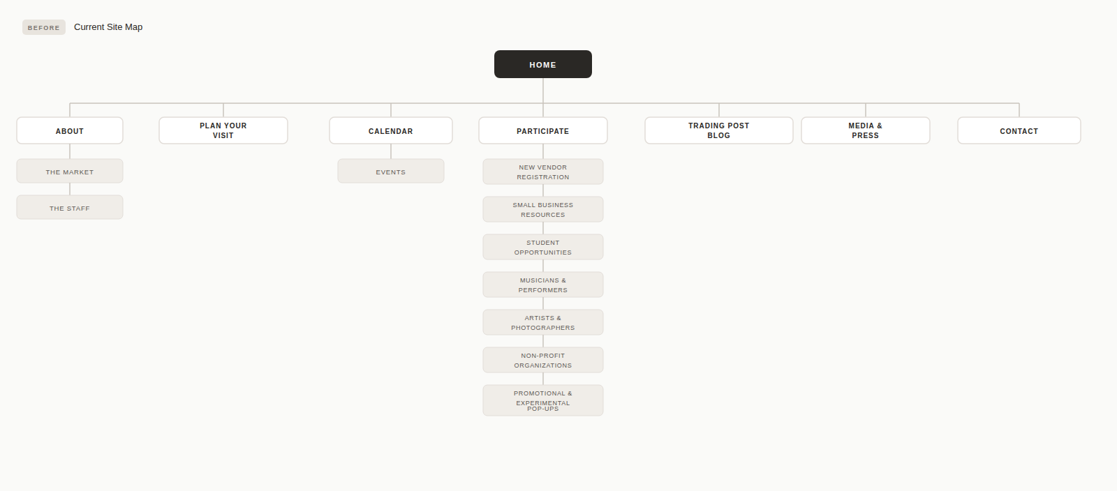
Current sitemap
⬇
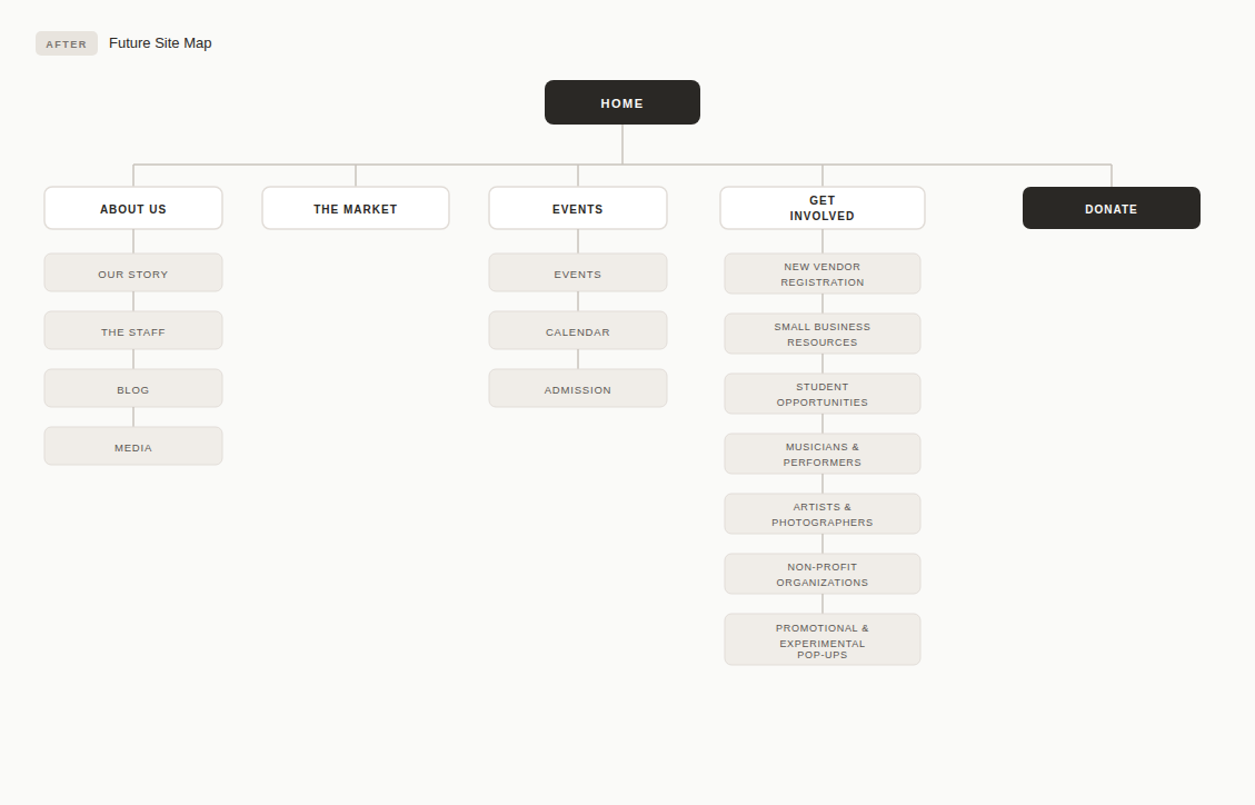
Redesigned Sitemap
Current vs. Redesigned User Flow
I mapped the existing booking flow step by step, then designed the future-state flow. The comparison made the problem concrete: users in the current flow had to navigate between two separate sites (MTP and Greenway Theatre) with no handoff, and could end up on dead event pages with no way back.
The redesigned flow collapses this into a single continuous path with clear breadcrumbs at every step.
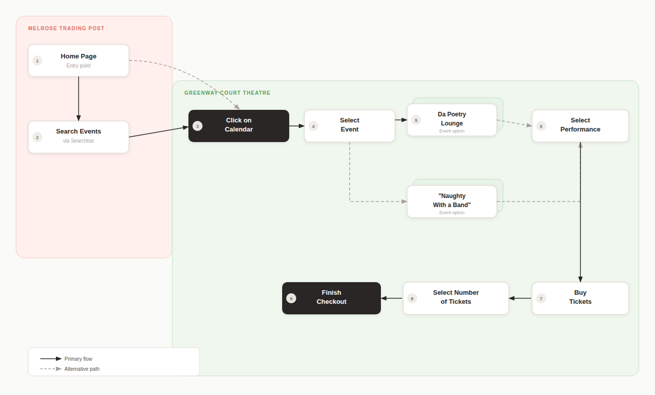
❌ Current Flow
Home page - no clear event. CTA above fold
Search bar (non-obvious, often skipped)
Calendar is buried in a secondary navigation
Dead event page - no backtrack option
Jump to separate Greenway site to buy tickets
52% abandon rate before completing a transaction
☑️ Redesign
Redesigned the iconography across all menus.
Hero immediately features next even + Get Tickets
Display the event calendar as a primary nav item.
Update event cards with date, image, and event info button.
Select performance will make it clear which show the user is selecting
Ticket stepper -Adult/Child, live subtotal.
Finish checkout - breadcrumb exit is always visible.
04 - Design Process
From empathy to prototype in 2 weeks
01 - Empathize
Heuristic evaluation, 25-person survey, user interviews to map mental models
02 - Define
Card sorting, current site map audit, journey mapping, persona creation
03 - Ideate
Feature prioritization, revised site map, IA restructure from 9 categories to 5
04 - Design
Paper prototype → mid-fi wireframes → hi-fi in Figma with full visual system
05 - Test
Usability testing on prototype, iterate on checkout flow and event card layout
05 - Mid to Hi Fidelity Prototype
The final prototype introduced a consistent visual system — teal nav, legible event cards, and a checkout flow a first-time user could complete without help.
The Redesign screen by screen
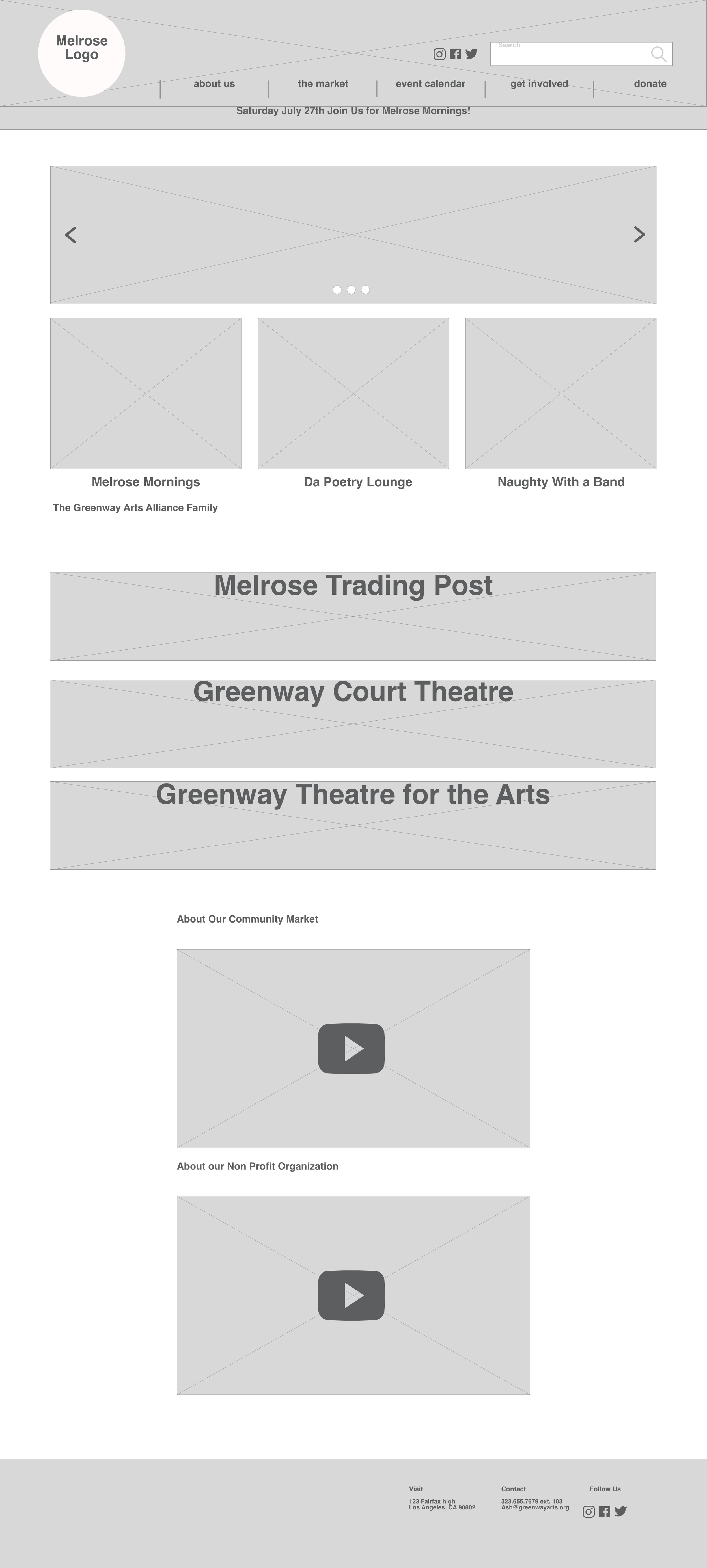
Mid-fidelity home page
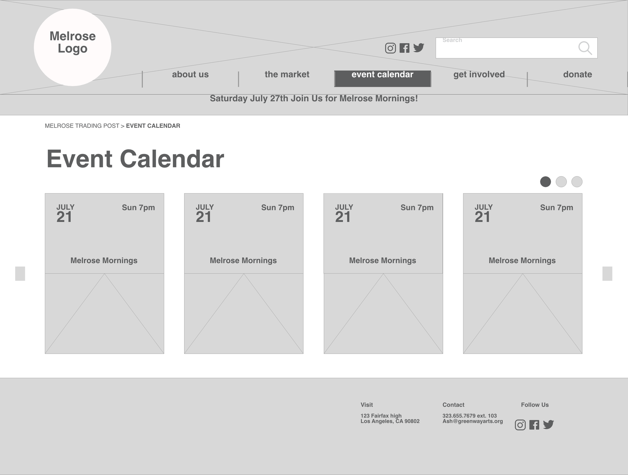
Mid-fidelity Calendar page
06 - Design Desicions
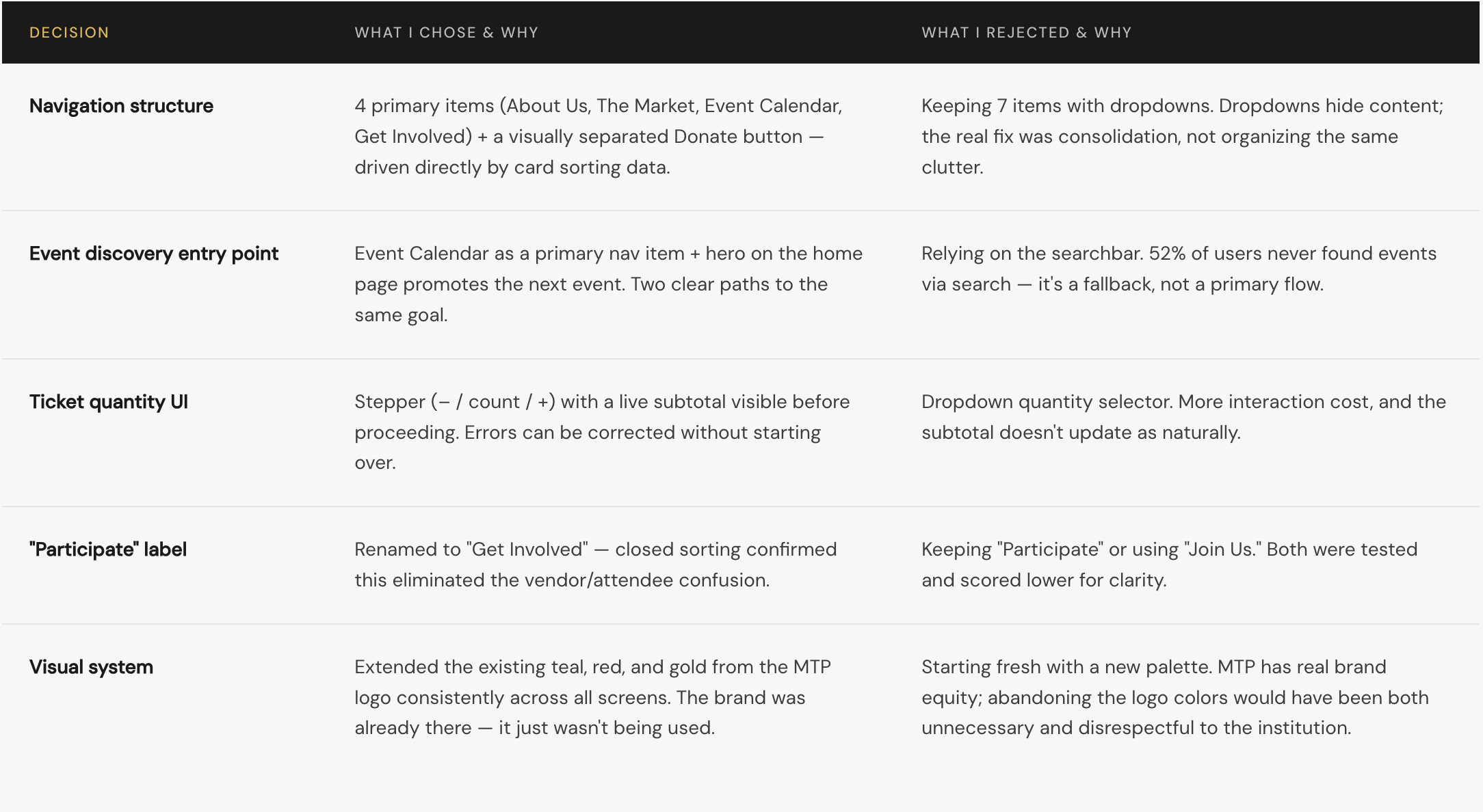
The Tradeoffs I worked through
Every decision had an alternative. These are the choices that shaped the final design and what I considered but ruled out.
07 - Reflection
What I learned and what’s still unfinished
What real data gave me
The 52% failure rate wasn't a gut feeling — it was a number. That data gave me moral authority to make bold structural changes that would have felt presumptuous without evidence. Research doesn't just inform design; it justifies it.
Whats genuinely unresolved
Mobile. I designed at desktop width, but MTP's audience discovers events on their phones. The event cards, ticket stepper, and checkout form all need rethinking for a 375px viewport. That's the biggest gap in this work.
What I’d do differently
I'd run a second usability test specifically on the checkout flow — ticket quantities, the Back button, and what happens on a sold-out show. I designed for the happy path. Edge cases need testing too.
What I’d validate before shipping
"Event Calendar" tested well in card sorting — but card sorting and real-world use are different things. I'd run 5 first-click tests on the final nav before considering this shipped.
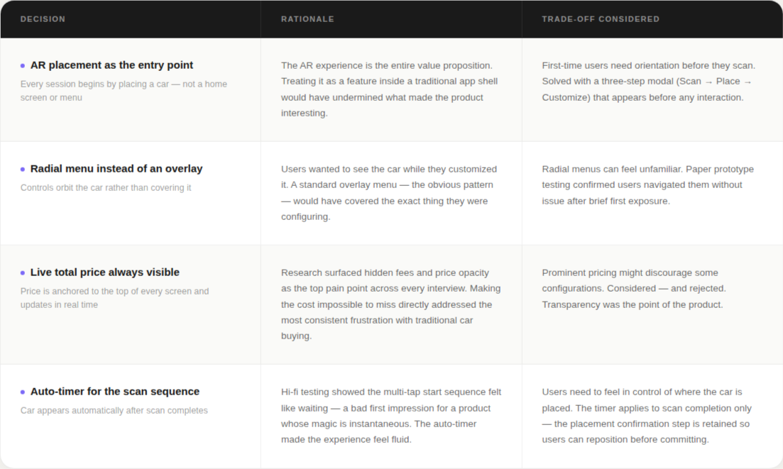
08 - Rationale
Key Design Decisions
09 - Next Steps
Where this goes from here
The hi-fi prototype proved the concept. Three clear development paths were identified for the next phase.
01 - Partner with car manufacturers
Build white-label versions for individual brands — incorporating their model libraries, color systems, and pricing alongside Divergent 3D's printed components.The "rescan" button caused confusion about its purpose and timing
02 - Integrate dealership inventory
Connect to live inventory data so the app surfaces real availability, actual dealer pricing, and nearby locations for the exact configured vehicle.
03 - Highlight Divergent 3D parts in context
Build a dedicated view that identifies exactly which components are Divergent-printed — making the company's core technology visible and meaningful at the moment of decision.
10 - Reflection
What this project taught me
Testing early is always worth it
The most valuable insight from this project didn't come from the hi-fi prototype — it came from the first paper session, when users were confused by the "rescan" button and couldn't navigate back to home. That finding shaped every subsequent version at zero visual design cost.
In a two-week sprint especially, the instinct to skip early testing in favor of getting to "real" screens is exactly backwards. Low fidelity gives you permission to be wrong when being wrong is cheapest
AR interaction design needs its own playbook
Most mobile UX conventions assume a 2D screen with a fixed viewport. AR breaks both assumptions — the environment is 3D, the viewport moves, and the "screen" is the real world. Patterns that work perfectly in a standard app can actively undermine an AR experience.
Given more time, I'd have explored how AR-native patterns — spatial anchoring, gaze-triggered menus, gesture controls — might reduce reliance on on-screen UI altogether, making the experience feel less like an app and more like a showroom.