Speculative Design Project
An AR app that brings car buying into your living room
Client
Divergent 3D
My Role
UI/UX Designer - Research, IA, Prototyping, Testing
Tools
Figma • Photoshop • InVision
Timeline
2-week design sprint
01 - Context
Divergent 3D has developed a manufacturing process that produces structural car parts through 3D printing — lighter, stronger, and more sustainable than traditional methods. The challenge: how do you make that technology tangible to a car buyer standing in a showroom?
This project explored an augmented reality mobile application that simulates the car buying experience end-to-end — placing a full-scale vehicle in your physical environment, configuring it in real time, and exploring its Divergent-printed components in context. Conceived as a white-label platform that any dealership could adopt as their own.
Divergent 3D wants to sell technology, not just build it
The Brief
Make cutting-edge technology feel personal
Design a prototype AR app with four core capabilities: surface scanning, real-time customization with live pricing, 360° and interior views, and a showcase of Divergent 3D-printed parts.
The Opportunity
Reinvent the dealership on the buyer's terms
Research confirmed the traditional car buying experience was adversarial and opaque. AR could give buyers complete control — no pressure, no surprise fees, real customization before ever visiting a lot.
02 - Process
Five Stages, two weeks
With a two-week sprint, sequencing mattered. Research was front-loaded to avoid building on assumptions, and user tests ran at every fidelity level — paper, mid-fi, and hi-fi — so problems were caught before they were expensive to fix.
Empathize
Competitive analysis of AR automotive apps, online survey, and in-person interviews with car enthusiasts.
Define
Persona, journey map, and a prioritized feature list scoped for a two-week prototype.
Ideate
Information architecture, sitemap, and paper prototype to test flow logic before any visual design.
Design
Mid-fidelity wireframes iterated into full hi-fidelity production screens in InVision.
Test
Three moderated usability sessions — one at each fidelity — with documented insights and actions taken.
03 - Research
Since no Divergent 3D app existed to audit, we looked outward. Three AR automotive apps were evaluated: the Porsche AR Visualizer (surface scanning and placement), Forma Car (360° interior), and AR Showcase (component exploration and customization controls). Alongside this, an online survey and in-person interviews with car enthusiasts gave us the user perspective.
Studying the landscape before designing for it
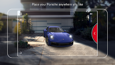
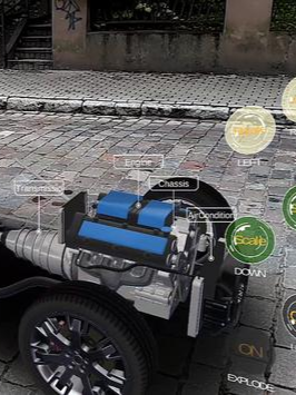
Porsche AR Visualizer — surface scan and placement. Forma Car — 360° interior view. AR Showcase — component-level exploration and customization controls. AR Showcase's approach to exposing vehicle parts became the direct foundation for our Divergent 3D printed parts feature.
Survey Interviews and Quotes
I conducted an online survey for car enthusiasts to gain insight on their car buying behavior.
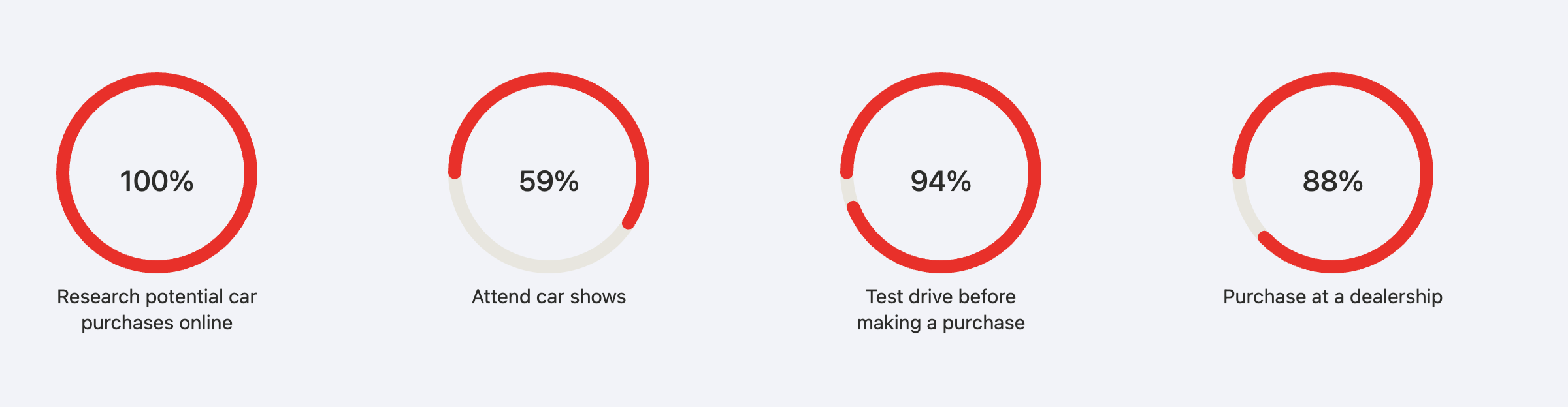
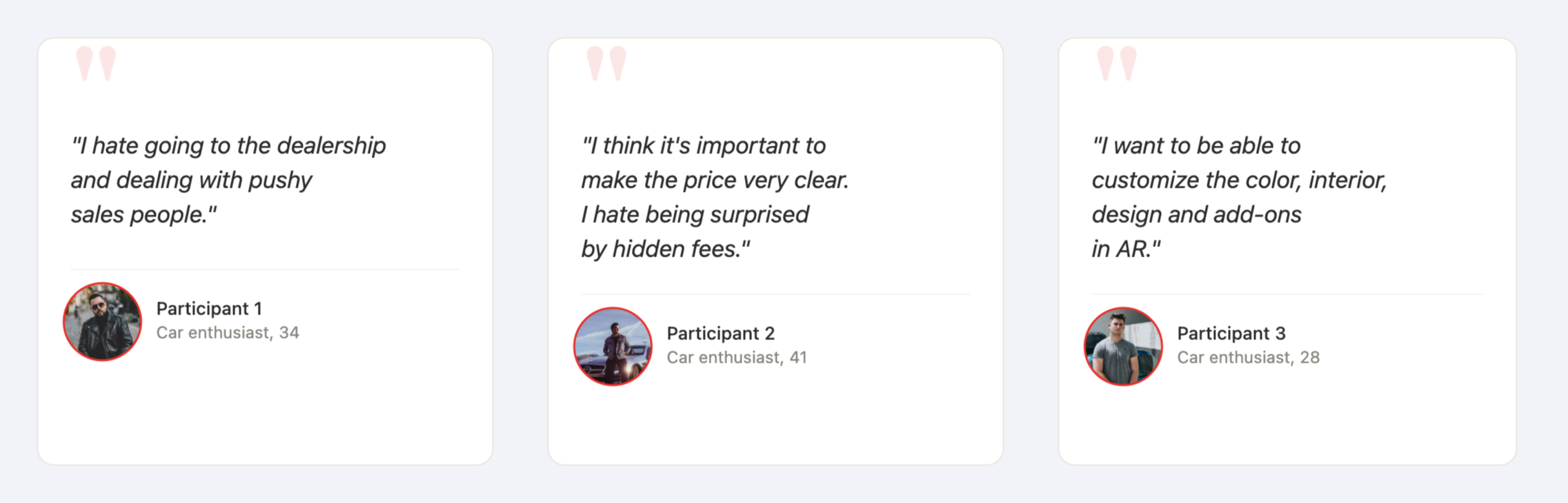
100% of respondents research car purchases online. 94% test drive before buying. 88% still complete the purchase at a dealership — meaning the in-person experience remains unavoidable, but deeply flawed. The interview quotes crystallized the pain: pressure, hidden fees, and no real ability to customize.
04 - Define
Persona & Journey map

Persona build from customer research: Max Momento
Max’s car buying experience
“My car reflects how far I’ve com in life”.
Goals
Buy a high-performance, luxury vehicle that makes a statement and is fun to drive.
Settle on a car color and needs, but open to different makes.
Needs
Evaluate car brands’ different identities.
Understand various add-on features and their prices.
Pain Points
Only being able to test out a car’s performance, smart features, and interior at the dealership.
Being rushed into making a purchase.
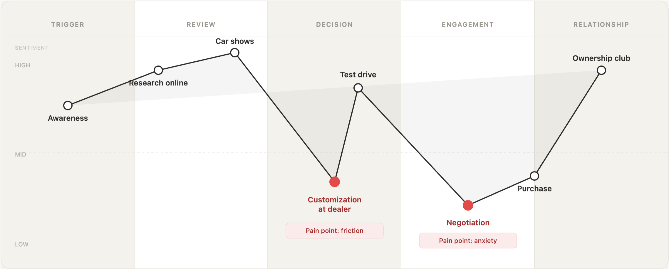
Takeaways
Max’s experience suffers at the dealership since he does not enjoy having to haggle with a sales person over add-on features.
The happiness experience factor goes up during the test-drive process.
Max’s experience drops during the negotiation process where he has to go through all the paper work and more haggling.
05 - Information Architecture
Mapping the application before building it
With no existing app to reference, the sitemap was foundational. The app flows from a single entry point — scan a surface — then branches into three primary menus: About (car library, company info), Customization (interior, exterior, performance parts), and View (360° rotation, interior, frame, engine). All routes begin in AR rather than a traditional home screen.
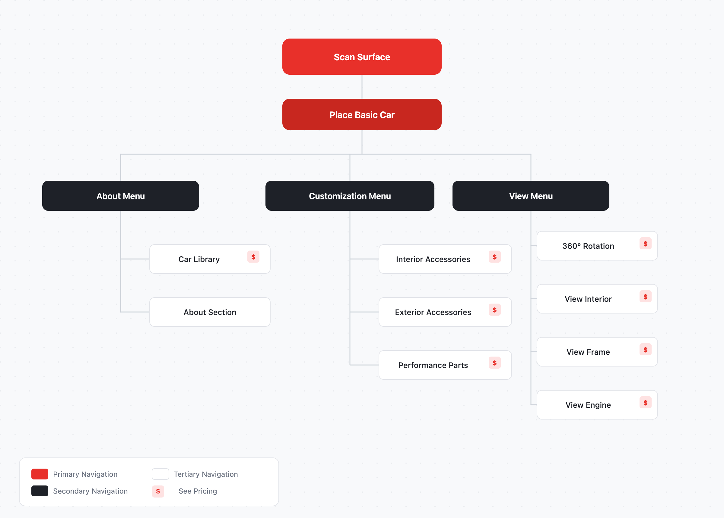
The three-tier color system — primary (dark red), secondary (medium red), tertiary (white) — maps directly to the radial menu hierarchy in the final prototype. Items marked with * are priced separately, making the pricing structure visible at the architecture level before a single screen was designed.
06 - Prototyping & Testing
Testing at every fidelity stage prevented expensive late-stage rework. Each round produced specific, actionable insights — not vague impressions — and every issue was resolved before moving to higher fidelity.
Three rounds of prototypes, three rounds of learning
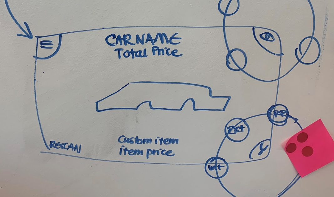
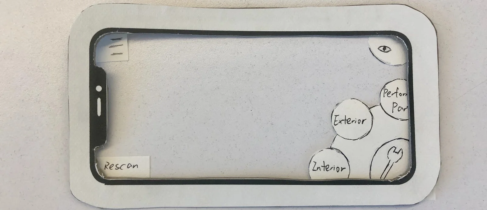
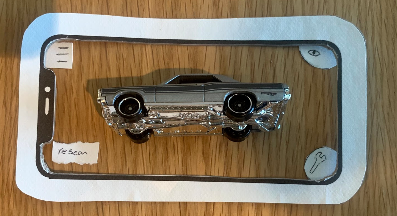
Round 01 - Paper Prototype
Testing the flow before touching pixels
A rough paper prototype tested the core AR interaction — scanning, placement, and the off-screen rotating menus for customization. Testing this early, before any visual design investment, let us focus entirely on whether the flow made sense.
Key Learnings
Users navigated the rotating menus without issue — except for back and home.
Users navigated the rotating menus without issue - except for back and home.
Several icons were not understood without labels.
The "rescan" button caused confusion about its purpose and timing.
What Changed
Redesigned the iconography across all menus.
Retested spacing and layout at actual phone scale.
Eliminated the “rescan” button entirely.
Added gestural indicator icons for the home and back navigation.
Round 02 - Mid-Fidelity Prototype
Refining the AR interaction model
Moving to mid-fi allowed us to test with actual digital interactions — tap targets, menu behavior, and the AR placement sequence. The car was rendered in low-fidelity 3D, giving users a real sense of scale and motion for the first time.
Key Learnings
Some revised icons were still unclear to participants
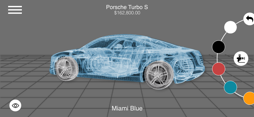
Users missed the price change display shown above the car
Button size inconsistencies were distracting and broke immersion
What Changed
Replaced remaining unclear icons with labelled alternatives
Made price changes visually prominent, tied to each configuration action
Adjusted all button sizing to meet iOS Human Interface Guidelines
Round 03 - Hi-Fidelity Prototype
Streaming the starting sequence
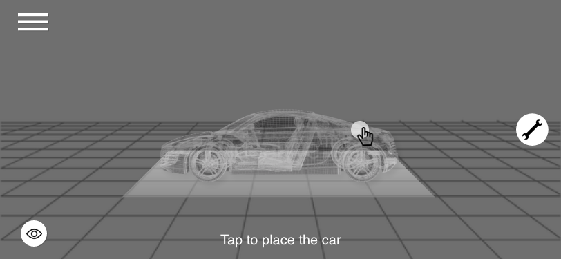
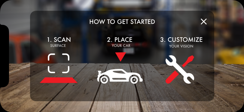
With production-quality screens, the final round tested the complete AR onboarding flow. The "How to Get Started" modal tested well — but the multi-tap start sequence was a friction point that needed to go.
Key Learnings
Users had to navigate several taps before the car appeared — felt like waiting
The three-step onboarding modal (Scan → Place → Customize) was immediately understood
Price changes during customization were still not drawing enough attention
What Changed
Replaced multi-tap start with an auto-timer — car appears without extra steps
Animated price changes so the update is impossible to miss
07 - Final Design
The hi-fi walkthrough
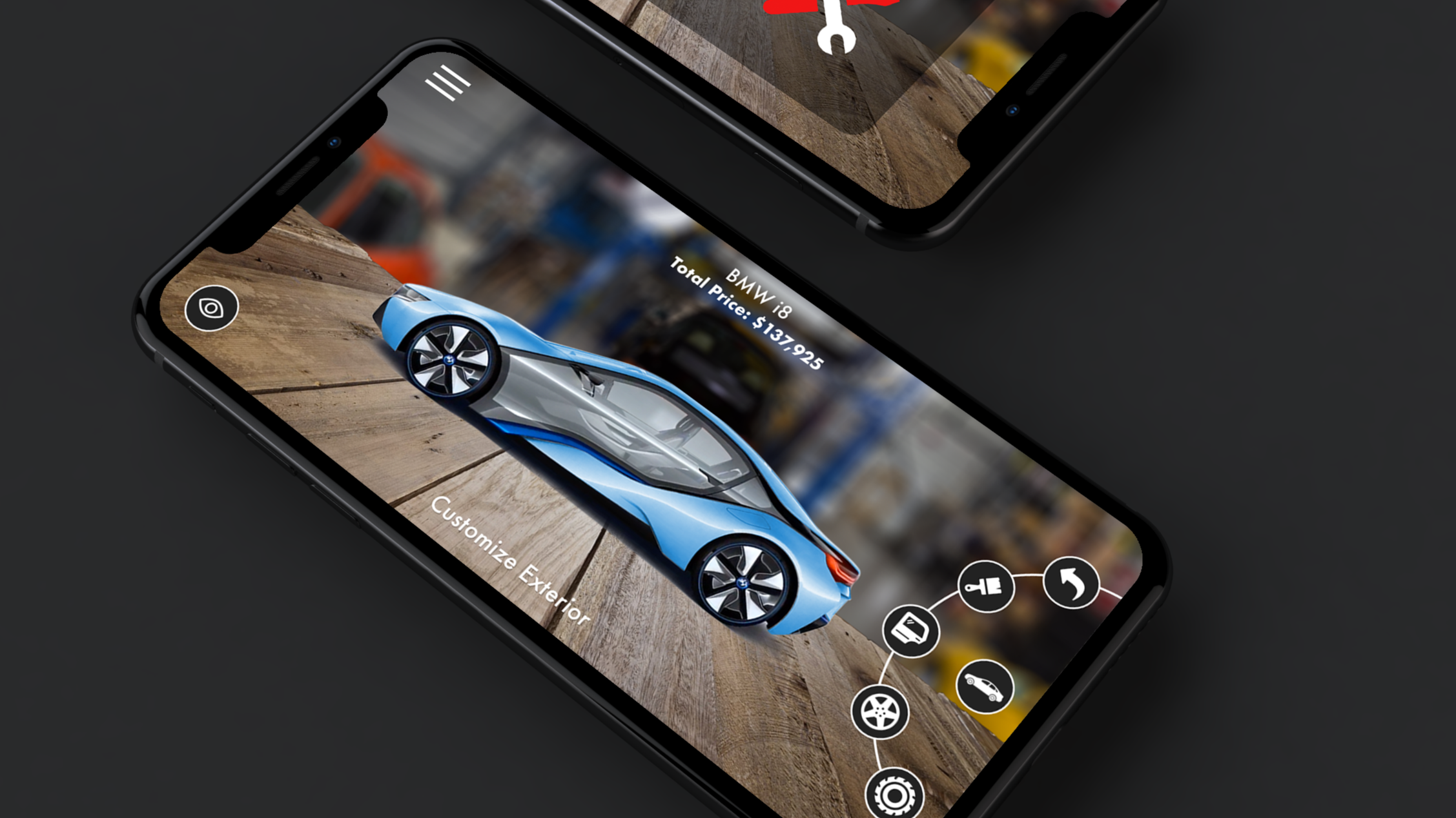
The final prototype brought together all three testing rounds: an auto-start AR sequence, a radial menu that keeps the vehicle fully visible, real-time pricing tied to every configuration choice, and a smooth rotation experience that lets buyers explore from every angle.
The final prototype brought together all three testing rounds: an auto-start AR sequence, a radial menu that keeps the vehicle fully visible, real-time pricing tied to every configuration choice, and a smooth rotation experience that lets buyers explore from every angle.
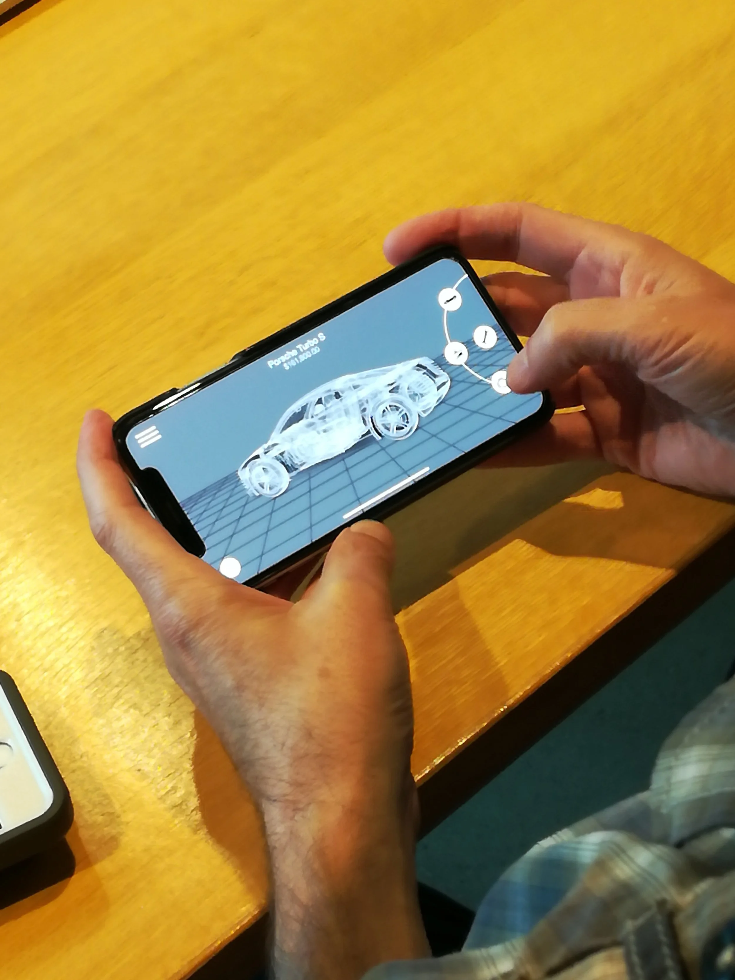
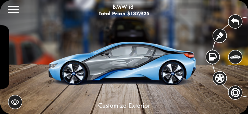
360° rotation + radial action menu — Customize Exterior
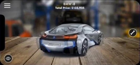
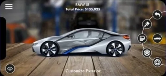
Left: full 360° rotation — users drag to spin the car and see every angle without leaving the AR view. Right: the radial menu expanded, orbiting the car rather than overlaying it. The label at the bottom ("Customize Exterior") confirms the active context so users always know where they are in the flow.
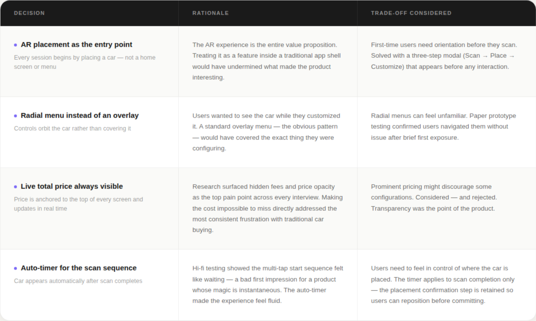
08 - Rationale
Key Design Decisions
09 - Next Steps
Where this goes from here
The hi-fi prototype proved the concept. Three clear development paths were identified for the next phase.
01 - Partner with car manufacturers
Build white-label versions for individual brands — incorporating their model libraries, color systems, and pricing alongside Divergent 3D's printed components.The "rescan" button caused confusion about its purpose and timing
02 - Integrate dealership inventory
Connect to live inventory data so the app surfaces real availability, actual dealer pricing, and nearby locations for the exact configured vehicle.
03 - Highlight Divergent 3D parts in context
Build a dedicated view that identifies exactly which components are Divergent-printed — making the company's core technology visible and meaningful at the moment of decision.
10 - Reflection
What this project taught me
Testing early is always worth it
The most valuable insight from this project didn't come from the hi-fi prototype — it came from the first paper session, when users were confused by the "rescan" button and couldn't navigate back to home. That finding shaped every subsequent version at zero visual design cost.
In a two-week sprint especially, the instinct to skip early testing in favor of getting to "real" screens is exactly backwards. Low fidelity gives you permission to be wrong when being wrong is cheapest
AR interaction design needs its own playbook
Most mobile UX conventions assume a 2D screen with a fixed viewport. AR breaks both assumptions — the environment is 3D, the viewport moves, and the "screen" is the real world. Patterns that work perfectly in a standard app can actively undermine an AR experience.
Given more time, I'd have explored how AR-native patterns — spatial anchoring, gaze-triggered menus, gesture controls — might reduce reliance on on-screen UI altogether, making the experience feel less like an app and more like a showroom.