Melrose Trading Post • Website Redesign
Fixing a flea market that forgot its users
Role
UI/UX Designer
Context
Bootcamp Capstone
Timeline
2 Weeks
Tools
Sketch • Figma
01 - Context
A beloved market with a website that worked against it
Melrose Trading Post is a weekly outdoor market and event venue in West Hollywood that specialize in vintage finds, live performances, local vendors.
The website told a different story. Chaotic navigation, an event-booking flow that more than half of users couldn't complete, and brand visuals that didn't communicate the energy of the place. Ticket sales for performances were the direct casualty.
My goals: restructure the information architecture so users could actually find and book events, and build a visual identity that felt as alive as the market itself.
The Problem
The site was designed around the organization's internal structure, not the user's mental model. Example: The event calendar was buried. Users hit dead ends with no way back. The checkout lived on a completely separate website.
02 - Research
Heuristic evaluation, a quantitative survey, and card sorting ran in parallel to build a multi-layered picture of where the site was breaking down — and why.
I didn’t guess at the problems
Heuristic Evaluation - Nielsen’s 10 Principles
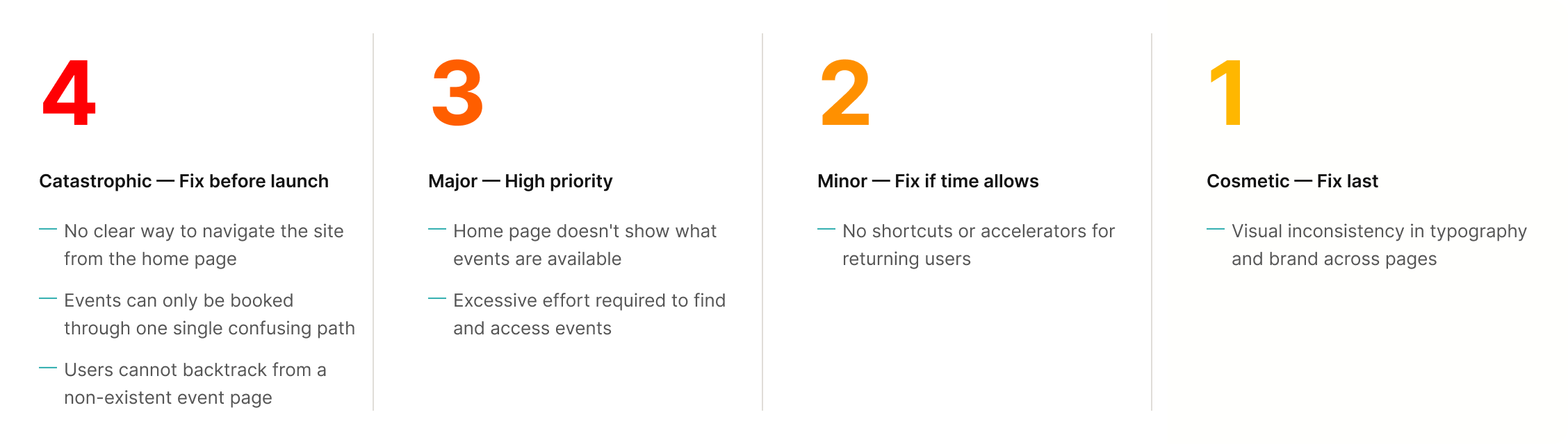
I evaluated every screen of the current site against Nielsen's heuristics, rating each issue by severity. Three Severity 4 issues emerged that would block almost any user from completing their primary goal.
The pattern was clear: the site was built around how MTP thinks about itself, not how users think about finding and attending events.
Online Survey - 52% failure rate
25 people were asked to navigate the current site and add an event to their cart. This is the site's primary user goal. Just over half couldn't do it.
That single number justified the entire redesign. This was a structural problem.
Card Sorting - 9 categories were brought down to 4
Open sorting let users group the existing navigation however felt natural. Without prompting, they collapsed 9 categories into 4. Closed sorting confirmed the groupings and validated the labels.
03 - Define
The site map was the diagnosis and the prescription
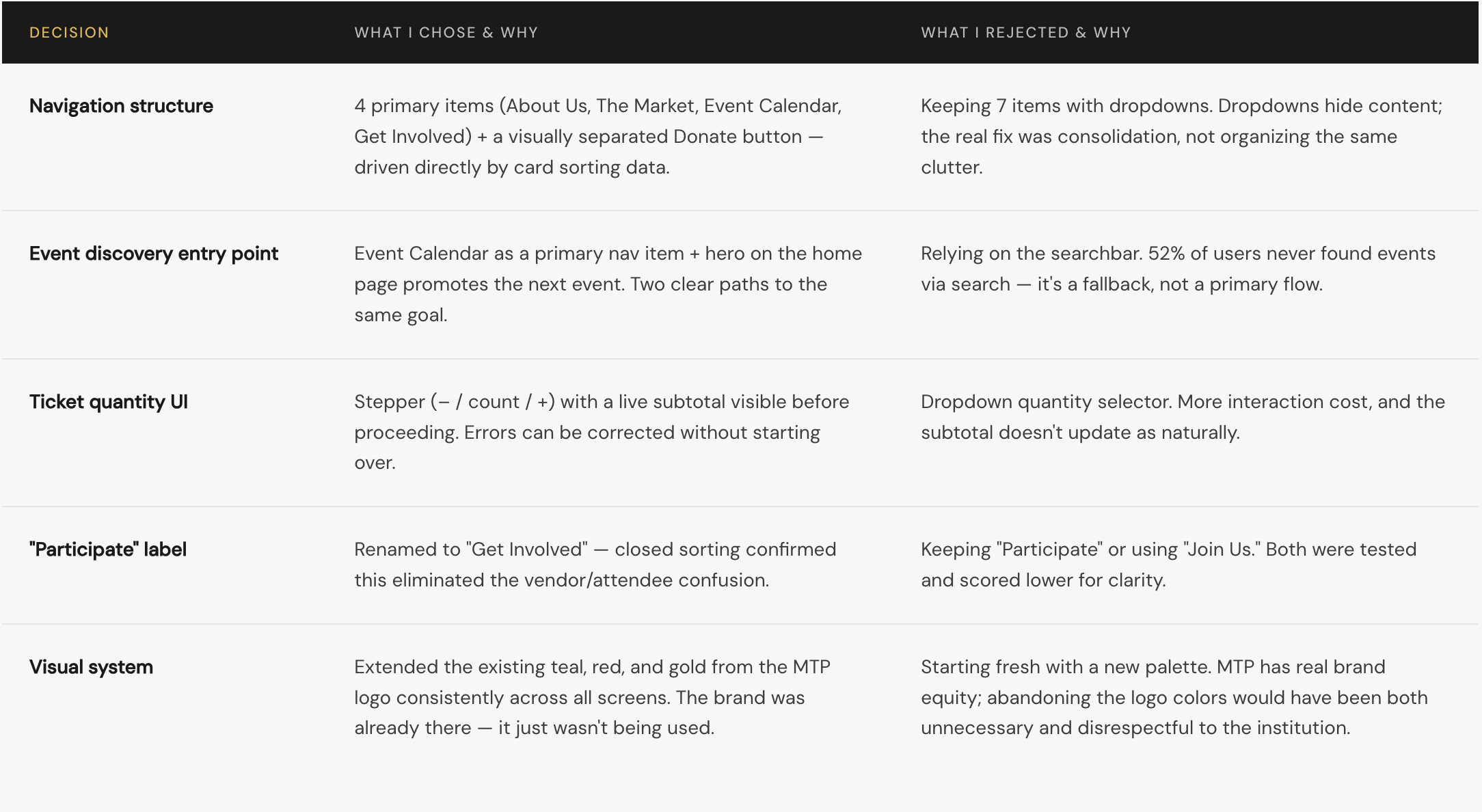
The redesigned site map consolidates 9 navigation items into 4 clear categories. “Participate” which previously contained 8 sub pages is renamed “Get involved” and restructured so vendor and community content no longer competes with event discovery.
The User flow
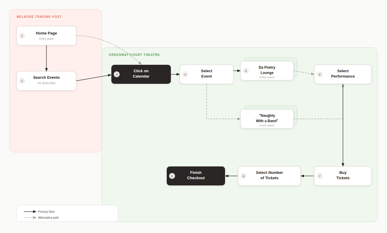
The original booking flow required users to navigate between two separate sites, MTP and Greenway court theatre. There were no breadcrumbs and a dead end event page that users were not able to escape. The redesigned flow consolidates everything into a single continuous path. Users move from the home page through an on-site event calendar, select a performance, choose their tickets, and finish checkout without leaving the MTP site
05 - Mid to Hi Fidelity Prototype
The mid fidelity was used to test the new layout and information architecture of the website.
The Redesign screen by screen
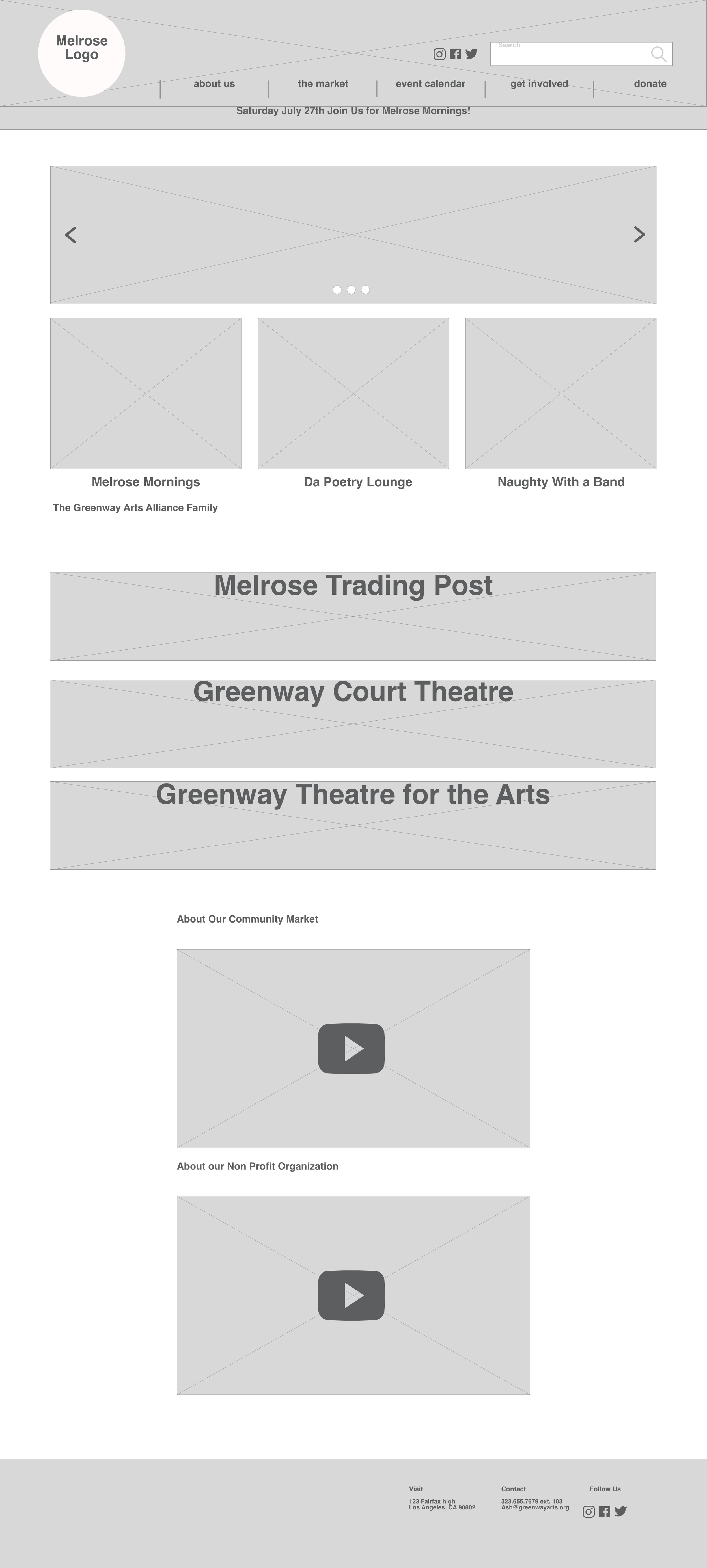
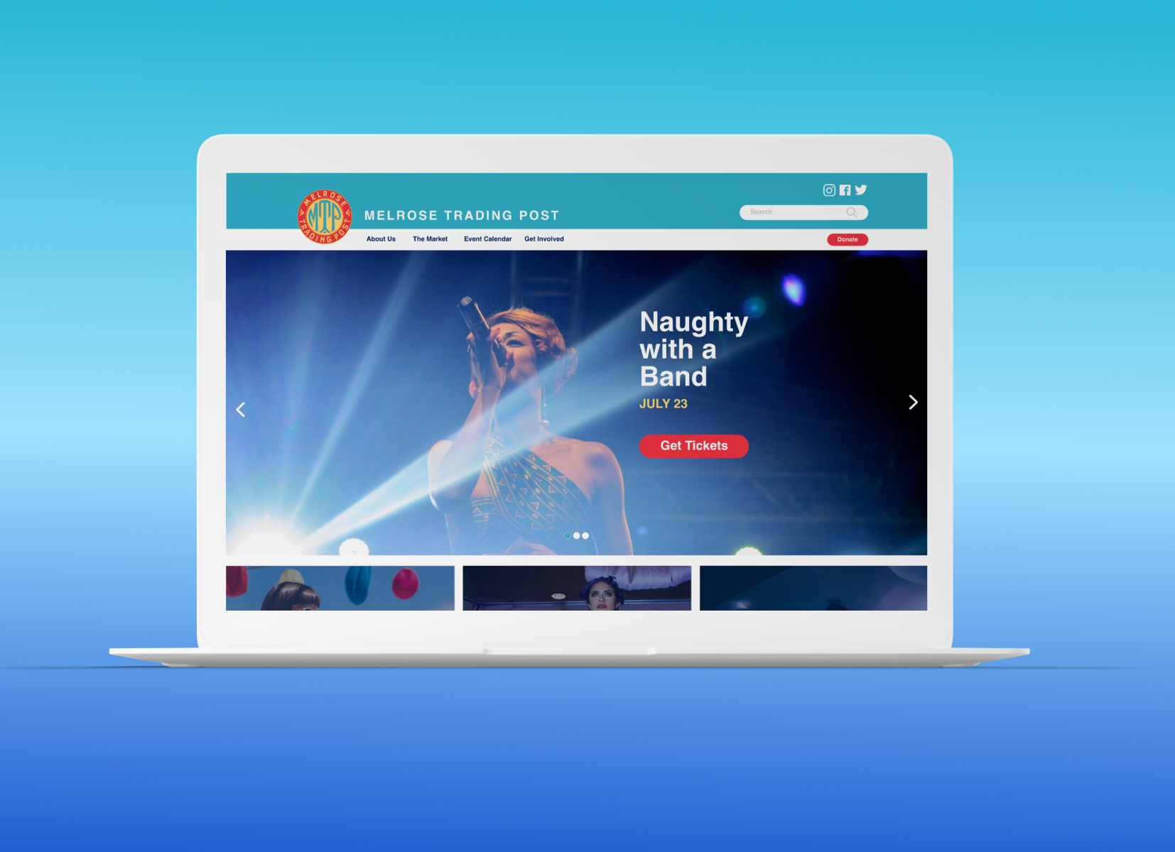
Mid-fidelity home page
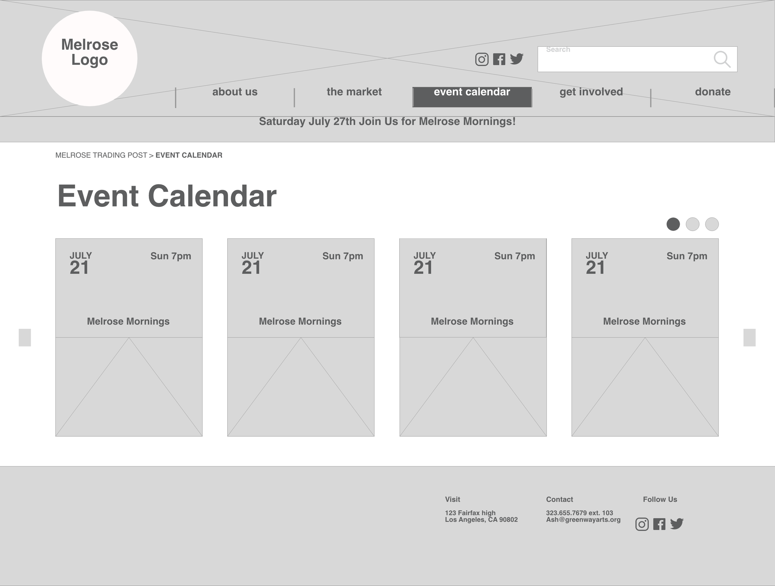
Mid-fidelity Calendar page
The final prototype introduced a consistent visual system — teal nav, legible event cards, and a checkout flow a first-time user could complete without help.
06 - Design Decisions
The Tradeoffs I worked through
Every decision had an alternative. These are the choices that shaped the final design and what I considered but ruled out.